Tampilkan postingan dengan label how to. Tampilkan semua postingan

Selasa, 29 Maret 2016

Games Design Process

Games Design Process
The Games Design Process

The computer games design process is based on the general design process but has a process which is solely focused around the area of computer games. The headings differ from those in the general design process but they are effectively the same steps just broken down further and retitled for a particular task. The overall process takes on the form of 3 major stages with each containing a subset of more specific stages. The stages are called pre-production, production and post-production. As the names suggest the processes central objective is the creation of the game. The stages are discussed in theory below and the application of this theory is explained through text and video tutorials on this website. Just use the search bar to find what you need.

Pre-production:

Analysis of Brief/Sector:

If you are designing a game for a client or for a college project you will be given a brief (set of instructions) that you will need to follow. Read these carefully and identify the key requirements that you need to fulfil. If you are designing the game for yourself then you will need to analyse the existing market, identify a gap or choose a game genre, engine and target audience. In this way you are creating your own brief.

Research:

Research is an important part of any design project and it will help you to identify possible software to use, genres to choose, ideas to develop, characters to animate and much, much more. It is also important to familiarise yourself with games already on the market as these will be the competition for your game and they will have set the standards that you need to meet or beat for your game to be successful.

Brainstorming: 

This is just a buzzword for idea generation and although the process may sound simple coming up with an idea for a game that is both original and interesting is very difficult. For example a FPS where a senile granny goes on a shooting rampage in a local park wearing a hospital gown, carrying two bags of shopping and shouting "quiet down!" may well be original but is it interesting to your target audience or even politically correct? I think not. This stage needs time and consideration; For help and assistance visit our article on idea generation.

Game Concepts/Objectives: 

Once you have decided on the basic idea for the game you then need to develop it further. What is it called? What are the characters called? What are they like? What is the objective of the game? How many levels? Where is it set? In what time is it set? All these questions and more need to be answered in order to develop a fully working, feasible and interesting game world that the player will want to get involved with and interact with.

Concept Art: 

Having decided on all the details, you then need to develop the style of the game. You will do this through concept art. Concept art demonstrates how the characters, terrains, building and objects will look. They may be in a cartoon style, a photo realistic style or anywhere in between.

Map development: 

Now that the details are in place and the style has been chosen, the layout of the game world must be considered. Is it a free roam map? Is it broken into territories or sections? Is it an island? These choices are yours to make (unless specified in the brief). This stage does not need to be too detailed and is merely intended as a basis for the main structure of the game.

Sketched Level Design: 

This stage develops on the level/game map and breaks it down into more detail. In these sketches you will sketch building plans, and map plans, level paths and more. These sketches will include the positioning of enemies, objects, pick-ups etc. It is a vital stage in the game design process as it the first and last time that you should be making actual game layout decisions which will directly affect the gameplay. You should base these decisions around the previous stages and the outcomes of your work during them.

Production:

Scale and Proportion:

Any game or level can appear huge or tiny depending on the scale of things relative to the character. As soon as you begin the production stage of your game, regardless of the software or game engine being used, you should place a character template or similar in the level to guide you in the correct scaling of your level.


Blocking out the Level:

This process is used to quickly layout the main sections and areas of a level. Each block may represent a building or cliff or vehicle or object etc. and doing this will allow you to quickly and easily get a sense of the environment you have created and make any necessary positional changes. It is also an ideal way to break down a large level into more manageable areas/blocks which can be detailed one at a time.


Adding Textures:

Textures should only be added after a level has been blocked out and all static meshes have been added. This is because textures are easier to edit and change than meshes and it is therefore better to match textures to meshes than vice versa. Most game engines will have a library of ready-made textures but creating your own is recommended as it will give your game a more original feel.

Adding Lighting: 

Lighting is one of the most important elements to a 3D game. Good lighting creates atmosphere, hides enemies, build tension for the player and makes a game look more realistic. Subtle changes and constant lighting rebuilds will take a lot of time so allow for that in your planning. Poor lighting cheapens a game, makes it look false and boring. Put in the time the time to get the rewards.

Adding Functionality and Interactivity:

As good as quality textures and feature lighting will make you game look unless it also has interesting and challenging elements for the player to interact with or use then it will not be successful. Things as simple as adding light switches and sliding doors add so much to a game by keeping the player constantly active as they roam around. More complex elements like elevators, vehicles, countdown clocks etc. will further enhance the player's experience.

Adding A.I.:

Artificial intelligence refers to elements in the game which can react to the players' movements, actions or decisions. They may be enemies or friendlies or other. Although complex to programme, once one is programmed correctly the same code can be used on an infinite amount of the same characters or only subtly edited for different characters.

Cinematics: 

These are short "movie" like interludes in the game used to inform the player on the game mission or objectives, give character information, hand out clues, show dialogue between characters etc. The reasons for using them are up to you but they are undoubtedly a great feature and add a sense of professionalism to your game while allowing the player a short respite from the action.


HUDs and Menus:

H.U.D. stands for heads up display and refers to the on screen game information which is displayed to assist or inform the player of what is happening. Items commonly displayed in the HUd are ammo, time, game map, health etc. The HUD needs to provide this information without intruding into the view of the player while playing the game, in most games the HUD can be toggled on/off. The menu is the first thing the player sees so it is great if it is interesting and enticing however the main function of the menu is of course to provide options for the player. Be sure your menu is clear and easy to use above all else.

Post-Production:

Testing: 

Once the game is packaged the process would appear to be complete but rigorous testing through gameplay is still required. Testing the game in the UDK editor as you go along is not sufficient to guarantee the game will be bug or glitch free. Many glitches are obvious after a few plays of the game and even if glitches are absent it is important to sure the game does not lag or freeze during certain elements of play.


Redesign: 

Based on the findings during the testing process various elements may need to be fixed or redesigned.

Packaging: 

Packaging the game refers to the act of compiling the game folders and files into an executable version of the game that others could download, install and play. Although this is one of the last stages its success is dependent on the correct set up of the level map and related files in the early stage of the production stages.

Promoting: 

Any game needs to be well promoted through eye-catching disc covers, DVD box packaging, internet ads, posters etc. Without good promotion, no matter how good the game is nobody will ever hear about it and therefore will never get the chance to play it. For help and assistance in creating the promotional graphics for your game visit our Photoshop and Illustrator tutorials.


What Next...

Now that you understand the theory why not try to apply this theory using the text and video tutorials in the UE4 section to guide you along the way. If you enjoyed this article then perhaps our articles on the webgraphicinterior or furniture design processes may also be of interest.


Baca selengkapnya

Senin, 29 Februari 2016

SEO For Images

SEO for images
Screenshot from the Google search results page


If your web graphics are optimized for Image search engines like Google they will help to generate an alternate source of traffic to your website. But unlike regular web search where we are more familiar with how search engines rank content, the rules associated with Image search rankings are very different and often based on assumptions.

Why do I say this ? Try a search for "Google" on Google Image Search. None of the top results show images from the actual Google websites or even associated websites. Now if you repeat the search for Amazon, none of the top 5 images displayed are from the official Amazon website. So how do individuals and small companies manage to stay ahead of corporate giants in Image search results? It's to do with image optimization techniques like the ones discussed below.

Regarding optimization, here are 6 simple things that you should keep in mind for getting good rankings in Google Images Search:

1. Image File Name

Use a descriptive image file name which includes keywords related to the content of the image. If your webpage has pictures of an old country farm house - use file names like 'old-country-farm-house.jpg' instead of the default camera file name like IMG_401.jpg. In this way you are providing relevant information about the image to Google rather than just a string of meaningless numbers or letters.


2. Alt and Title

Attach a 7-8 word description with both the ALT and TITLE attributes of the IMG tag. Make it a habit to use these attributes. An example could be...

<img src="old-country-house.jpg" alt="dilapidated old county farmhouse in countryside" title="country style farm house ageing and run down">

3. Discuss The Image

A short two line description of the image just beneath the graphic is the best way to describe an image. It can work wonders for your image search rankings as well. For a live example, read any news story on the BBC websiteThe HTML tags enclosing the image descriptions will also matter. A description alongside a heading enclosed in H3 or Bold tag will have more weight than the one with just a description enclosed in the paragraph tag.

4. Wrapping Text

If possible, try to wrap text around your images using the CSS code of "float", like the old country farmhouse image above. If you site design won't allow wrapping text or if the image is large in size, try to place the images near text that describes the context of your image. Web Photo Galleries which have no text on the page can make use of the Title and Meta tags to insert information about the images.

5. Image Position On Page

From personal observation Web Images placed at the top of the page are more likely to appear in search results than the ones which are at the bottom. They do not have to be at the very top of the page but certainly 'above the fold' images tend to perform better than those below the fold.

6. Image Size

Another personal observation is that images which are very large or very small tend not to do very well in the search results. Try to keep images at sizes which will be useful to others who may be looking for them. In my experience images around 600px x 400px tend to do well.


If you do decide to use some or all of these tips, please keep an eye on your image performance and let us know how you get on.


Baca selengkapnya

Magazine Cover Design Features


Magazine Cover Design Features
Magazine Cover Design Layout

Designing a Magazine Cover? Then you need to be aware of these industry standard features, Both from a technical and a design point of view. First the Technical...

TECHNICAL

Size: 

Professional Magazine Covers (and therefore magazines themselves) are not A4 in size. This is a common misconception. The actual size is similar to A4 though; 8.5 inches x 11 inches is the standard.

Text: 

Your Magazine Cover should include the magazine name, tagline and selected article headings.

Main Image: 

You should ideally use just one main image. It should be a high quality image ideally on a plain background.

Little Details:  

Don't forget the Date, Price, Issue No. and Barcode

So with all those things in place you will technically have a magazine cover, but how do you make sure it is a good one...? Now lets look at the design.

DESIGN

Main Image:

Your image should be the dominant element on the cover, it should take up at least two thirds of the cover and should contrast with the background, keeping it centrally aligned it also best. It should also utilise at least one of the Attention Grabbing Technique. The most effective being Sexy or Iconic, if you use an attractive celebrity you will be achieving both at the same time, hence the reason they adorn the cover of most magazines. When using people use either head and shoulders or waist up photos for best impact.

Magazine Cover with Iconic Celebrity
Magazine Cover Using Iconic Celebrity On The Cover
The magazine title text is best large and bold old in a sans-serif font. The style of the font should also be appropriate to the style and topic of the magazine.  

Sub-Headings are best aligned to the sides, should include a variety of font styles, colours and sizes all still in sans-serif (see the sample below), contrast with the background and use buzz words or better still any of the 12 most powerful words


Magazine Cover
Magazine Cover utilising variety of sub heading styles, colours and sizes

And not forgetting the little details: They should be kept small, discreet and out of view (unless they are a feature of the sale – e.g. special discounted price)


So if you have taken all this on board are are still interested in creating your own magazine cover design then see our create a magazine cover tutorial. You may also be interested in reading about the most powerful words in the English language, which tend to feature regularly and prominently on magazine covers.


Baca selengkapnya

Rabu, 04 Maret 2015

How to set up margins and guidelines in Photoshop

Rulers Set up in Photoshop
In this tutorial you will learn how to set up the use of Rulers in Photoshop. Rulers are use to help you to position images and text in the exact position you require when using Photoshop.


Step One:

Select file and new and create a new file. I have chosen the settings off 8.5 inches for the width, 11 inches for the height, with 300 for the resolution and RGB color for the color mode.


Setting up a new file for Photoshop

Step Two:

For this demo I am going use some text to show how using rulers can position your text correctly.

Sample of a new canvas for setting up the ruler example

Step Three:

To set up the rulers manually, click view and a drop down menu will appear.

View drop down menu in Photoshop

Click to turn the rulers on. A guide will then appear with numbers on the top (Horizontal) and on the left hand (Vertical) side of the page. This is your rulers guide.

Image of Rulers as the appear in Photoshop


Step Four:
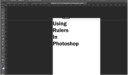
Now with your mouse, hover over the numbers until a white cursor appears. Click and drag down the top line and place onto the template at desire level. Clicking and the pulling down of the rulers (Horizontal).


Adding of the Rulers (horizontal)

Bring the rulers in from the left hand size (Vertical)

Adding of Rulers (Vertical)

All the rulers in place.

All the Rulers in the correct positions

Step Five:

As you can see from the above image the text is on the outside of the rulers on the left hand side. To move the text into the correct place, select the text layer, on the right hand size and with the move tool and move into position. 

Rulers and Text in the correct position

Step Six:

You can also set up the rulers to the exact measurement required. To do this, again select view, and the drop down menu will appear, scroll down and select “New Guides”. A pop up menu will appear and you are able to select the correct measurement for the rulers by selecting either horizontal or vertical position.

Drop down menu once selected the View option on Photoshop

Pop up menu to select the correct measurements 

Selecting the measurements in the New Guide

For this demo I selected the measure for the Horizontal (top) for 3cm, with the Vertical (left side) set also at 3cm. Again for the bottom Horizontal and right side Vertical set the setting to this time 3mm for the rulers to appear.  Example show in the images below.


Creating the Horizontal Ruler with the correct measurement

New guides rulers for Horizontal and Vertical (3cm)

Horizontal and Vertical rulers appearing in Photoshop


Rulers in place after creating them with the new guide option in the view section of Photoshop. To move the text into the correct place, select the text layer, on the right hand size and with the move tool and move into position. 

Rulers and Text in the correct position on Photoshop
Baca selengkapnya

How to use Bezier Curves in Blender


An edited curve

What are curves within Blender?

Curves within blender are normally used to create the outline of an object or trace over something e.g. a picture. It is similar to the pen tool in Photoshop as to how it works and what it’s used for. There are two types of Curves, Bezier and Circle.

How to use the Curve tool

In this tutorial I will be drawing a Batman logo to show you how to use the Bezier Curve.

Step One:When you are ready to add your curve in to the stage, go into Orthographic view (numpad 5) and top down view (numpad 7) and delete the default box by right clicking it and pressing x then clicking delete. Then press shift+A> Curves>Bezier Curve and you will see the following:


newly added curve

This is your curve. It cannot be edited or re-shaped until you go into edit mode by pressing TAB. Once there you should see this:

handles on curve

The layout the curve is in can look quite complicated and the arrows tend to throw people off. If you’d prefer to turn them off press N then in the new menu that appears, under “Curve display” un-tick normal as shown below and the arrows will disappear.

getting rid of normal

Step Two: To change the shape of the curves you use the handles which are the red straight lines coming from the points. The points between the two red handles, on the curved line are where the curve's control points are. These points can be moved to change where the curve actually is. The red lines can be adjusted in length and position. The length changes how big the curve is and the position changes the direction. Play around with the handles a bit to get used to them.

adjusting the handles

Step Three:If you practised step two you will notice that when you change the position of one handle, the other handle stays in line with the one you changed. This is because of the handle type. To change this press V and click on vector and you will notice the handles go green and can be adjusted freely.

vector handles

The vector handles are necessary to create shapes where the curves on either side of a point go in different directions e.g. the Batman logo wings as seen below. To add a new point, right click the point you want it added on to, and press E (for extrude). You will then notice you are dragging a new point. Place it in a suitable location and adjust it how you want.

adding a new point

Continue this process until you have the shape you want. If the shape you want to make is symmetrical, you only need to draw up half of the shape. To see the shape without handles, go back into object mode using TAB. To continue editing, press TAB again.

how to see your shape

Step Four:If the shape your drawing with your curves is symmetrical then you will need to duplicate it, then mirror it. To do this get out of edit mode into object mode, press Shift+D then enter and then press CTRL+M+X then enter. Reposition it if it is off.

mirroring your shape

This has given us two different Bezier curves which can’t be edited at the same time. To change this go into object mode, right click one so it is highlighted as above, then Shift right click the other and press Shift+J to join them. You can then TAB back into edit mode. Here you can right click one point, then shift right click the corresponding one on the mirror side, and press F to connect them (stands for fill).This is how I connected the head above and the tail below.

finished shape

When you connect the two points at the bottom for the tail, you need to add a new point in the middle to drag down. To do this click subdivide in the left toolbar after you connect them by pressing F, as shown below:

subdividing your curve line

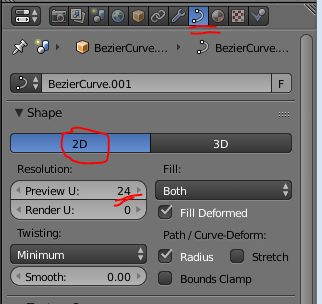
Step Five:We now have the outline of our shape finished but now we can make it more detailed, or turn it into a rendered image. This last step is not necessary, but it is good practice and turns the curve into a nice image.To begin this process we have to click the curves tab in the right toolbar and change it to 2D to fill the shape in. make sure you have the curve selected to get the curve tab to show. you can also change the resolution to 24 to give it more definition.

making your curve solid

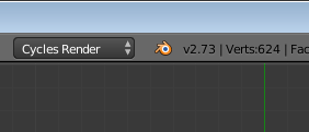
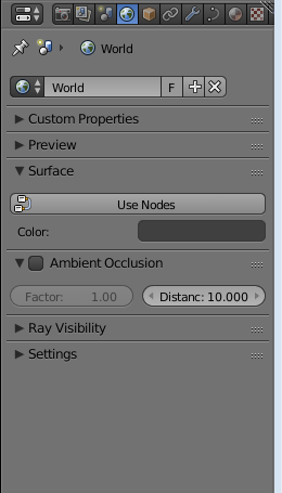
You can then go to the top of the stage to where it says blender render and change it to cycles render. After that, click the world tab (you must have nothing selected. Press A while over the stage to deselect if you have anything selected) in the right toolbar to get the menu below displayed.

making your curve an image

changing colour of background

In this menu go to surface and change the colour to what you want the background of the image to look like. I chose black.

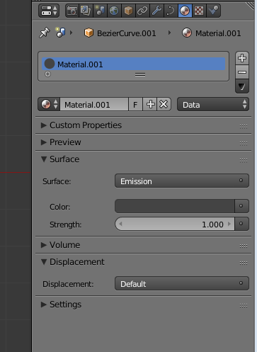
You can then right click the curve and click the material tab in the same area where the world tab was. Add a material by clicking the add material button then go down to surface. change the surface to emission, then pick the colour you want to use.


changing colour of curve

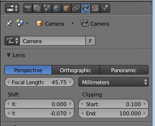
Finally, position your view of the image to wherever you want the camera to be. I recommend using a top down view (numpad 7). You then press CTRL+ALT+Numpad 0 to set the cameras location. You can press numpad 0 again to exit out of the camera view. Right click the camera then click the camcorder tab in the same place where the world and material tabs were. Change to Orthographic and use the Focal Length and the Shift options shown below to reposition the camera. To view these changes press numpad 0 over the stage again to show the view. It will update to the changes you make in real time.

taking a picture

Once you’re happy with the position of the camera and the other settings you have made, click the camera tab and then click render, or just hover over the stage and press F12 to take a rendered image of your curve. As you can see below, I have a fully finished rendered image of my custom made batman logo.

Bezier Curve Batman Logo in Blender
final image

Baca selengkapnya