Tampilkan postingan dengan label adobe photoshop. Tampilkan semua postingan

Rabu, 08 Juni 2016

Create your own Angry Bird

The Angry Bird Family
Which Angry Bird will you create? 

Following the release of the Angry Birds Movie we thought it might be fun to practice our graphic design skills and make our very own Angry Bird. This tutorial is completed in Illustrator but all the tools and techniques used are also available in Photoshop. The reason I am using Illustrator is that Illustrator is the best program for creating vector graphics using the pen tool. Logos and cartoons are normally made with the pen tool so they are created as vector graphics, allowing them to be resized up or down without loss of quality, therefore this image will be created using the pen tool. If you are not familiar with the pen tool then you can read this guide to using the pen tool before you start.

Now that that is cleared up, let's begin making an Angry Bird!


1. Go to File-> New and create a canvas 700px wide and 500px tall.


2. Go to the layers window and rename the base layer 'Body'. Select the ellipse shape tool and create a circle, set the colour of the circle to red, as we'll be creating the red Angry Bird, and put a 7px black stroke on the circle.


3. Use the direct selection tool to move the top and left anchor points slightly, as seen in the image below.
The Angry Bird's Body

4. Now use the add anchor point tool (within the pen tool) to add 6 anchor points across the top of the body, don’t be too particular about the placement as we will be moving them soon anyway. See the image below.


5. Next select the direct selection tool and drag the 2nd and 4th anchor points upwards and the use the handles on each anchor point until the shape resembles the image below. (If there are no handles on the anchor points it is possible they are straight line anchor points, use the convert anchor point tool and click and drag slightly on each point to convert them to curved line anchor points.)

The infamous 'quiff' of the red angry bird

6. Now open the layers window and click the button circled in the image below and create a new layer, call it 'belly'.


7. Next, while on the belly layer, use the ellipse shape tool to create the rough shape of the belly, colour the shape in white and set the stroke to 0pt. Then zoom in and use the direct selection tool to move the anchor points and their handles into a shape similar to the image below.


8. Open the layers window again and click the new layer button and create a new layer, call it 'eyes'. If it is not the top layer, move it to the top. Use the ellipse tool to create two circles for the eyes, each circle should be white with a 3pt stroke. To overlap one eye over the other as show in the image below, right click on one eye and select move to front.


9. Next create a new layer, call it 'eyeballs'. Use the ellipse tool to create two small black circles without any stroke. Position the eyeballs as shown in the image below.


10. Again create a new layer, call it 'eyebrow' and ensure it is the top layer. Use the Pen tool and click (do not click and drag) one at a time creating new straight line anchor points in the shape shown below remembering to join the last anchor point to the original point.

The angry bird eyebrow
Getting the mono-brow right is the key to making him look angry
11. The next part of the image is the nose. Create a new layer, call it 'nose' and once again ensure it is the top layer. Use the pen tool to create the rough shape of the nose, remembering to join the last anchor point to the original anchor point. Give the shape a yellow colour and a 3pt stroke. To edit and refine the shape of the nose use the direct selection tool to move the anchor points and their handles around. You may also need to use the convert point tool as the nose shape uses both curved line and straight line anchor points. The image below shows the image alongside the layers used so far to create it.

The angry bird and the layers used so far

12. Finally, create one more layer - call it "tail" and again use the pen tool to create straight line anchor points to make up the tail shape. Position the layer beneath the body layer for best results. If you wish you can use the ellipse shape to create 2 more shapes for the 'freckles' , or whatever they are, on the body.
Red angry bird
The completed angry bird 

TIP: The pen tool can be difficult but remember practice makes perfect so after completing this tutorial perhaps try creating the rest of the angry bird family or other cartoon images.
Baca selengkapnya

Selasa, 19 April 2016

Image inside text using Photoshop

finished piece
Finished piece

Step 1.

In Photoshop pen up an image you want to be inside the text

open file in Photoshop
Open file in Photoshop


select image
Select image


Step 2.

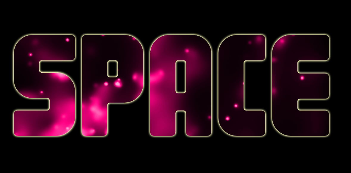
Create a text layer and add some text to it. In this example, I have typed the word 'Space'.


Step 3.

Right click on your image layer, in my case it is 'pink_gallaxy', and select the 'create clipping mask' option from the list that appears.

create clipping mask
Create clipping mask


Step 4.

Add a background colour (if you want) and that's it, simple as that.

Completed text effect with image inside it

Tip: you can left click inside the text and drag the image around to set it up the way you want.

Baca selengkapnya

Selasa, 15 Maret 2016

How to use the clone stamp tool (Photoshop)

Before and after the clone stamp tool has been used

The clone stamp tool is a very useful tool in Photoshop. It allows you to clone one area of an image and copy (stamp) it onto another area.

Step 1.

So first, in Photoshop, open any image from your computer by clicking File > Open.

Open file

Select file

The clone stamp tool is located below the brush tool and above history brush tool. You can also use the keyboard short-cut "S"  to use the clone stamp tool.

Clone Stamp Tool

Step 2.

Once we click the Clone Stamp Tool, the options bar at the top of the screen will populate with the associated clone stamp tool options. You can set your clone stamp options for the brush size, type, shape, opacity, flow and blending modes.

Option bar for Clone Stamp Tool

If you only want to copy an exact area of an image you will leave the default settings here but you can also change the brush size and shape.

Image before the clone stamp tool is used

Step 3.

So this is what our image looks like before, let's say that I want to remove the house that's hanging down from the balloons. I hold alt and left click on area I want to copy from, in this case that would be another area of the white cloud. And slowly brush over the house. (You will get a preview of the action by hovering the brush over the area before you click to paint/clone).

Image after some use of the clone stamp tool

Step 4.

You can see that the copied cloud area is now covering the house. Keep repeating until the house is completely gone or you have achieved the desired cloning effect that you want.

The house now covered by 'cloned' clouds using the clone stamp tool

Play around with different brush settings and options and try replacing different areas of your image to practice and get the hang of your Clone Stamp Tool.


Baca selengkapnya

Rabu, 09 Maret 2016

How to Use The Pen Tool

The Photoshop Pen tool
The pen tool and associated tools

The Pen Tools...

The Pen: This is what you use to draw paths and shapes of all kinds precisely by clicking to add a straight line anchor point and/or clicking and dragging to add a curved line anchor point. As you click to add anchor points they automatically join up in order of creation until you complete the shape by clicking back on the original (first) anchor point added.

The Freeform Pen: This freehand style is usually used when you are confident in what you’re going to draw and do not want to bother with anchors. However, it’s not commonly used as it is hard to draw perfect shapes with a mouse.

Add Anchor Point: Used to add a new anchor point after the shape is made.

Delete Anchor Point: Used to delete an anchor point from a shape.

Convert Point: Click on an anchor point in this mode to turn it into a Corner Point, or hold down your mouse and drag on an anchor point to turn it into a Smooth/Rounded Point.


Straight, Curved or Freeform Lines

Straight and curved lines created using the pen tool
A shape in progress showing 4 straight and 2 curved anchor point

As already mentioned there are two types of anchor points; straight line anchor points and curved line anchor points.

  • To create a straight line point you simply left click on the canvas when using the pen tool.
  • To create a curved line point left click, hold and drag to create the curve you want. A preview line will appear to show you what the line will look like. Once you release the left click the point is created.
  • As you continue to left click on different parts of the canvas the anchor points will automatically join together until you join the last anchor point with the original anchor point, thus completing the shape/path. You must join back to the first anchor point to properly complete the shape.
  • Once you complete the path/shape it can be moved using the path selection tool or edited using the direct selection tool.
  • You can also use the freeform pen tool to create free hand lines as shown below.
The freeform pen tool
The freeform pen tool allows the creations of shapes quickly but is less accurate
  • Anchor points can also be added to the shape/path, using the add anchor point tool (within the pen tool), or deleted from the shape/path using the delete anchor point tool (also within the pen tool).
  • Anchor points can also be converted from straight line points to curved points and vice versa. To do this, simply click on a point with the convert point tool.
  • Below are the available options under the pen tool options on top.

Pen Tool Modes

The pen tool modes
Add caption
  • Shape Layers – create solid coloured layers, this is the most common use of the pen tool.
  • Paths – create working paths for selection of an area or to create an invisible shape to hold a body of text.
  • Fill Pixels – create rasterized shapes that do not have shape editing capabilities once formed
So in summary, the pen tool can be used to create path selections, basic pre-set solid shapes and
stylish original vector shapes. Have fun testing out your skills with the pen tool in Photoshop, InDesign or Illustrator.


Baca selengkapnya

Photoshop Text Tips

You can do a lot with text in Photoshop through both simple and advanced techniques

Photoshop was and still is primarily a photo editing software and always will be but it does have a wide range of text editing tools and capabilities that often go untapped or unnoticed by us. The tips below will help you to make the most of text in Photoshop.

Box Over Point

Always create a text box rather than a text point. Click and drag when using the text tool to create a text box. This gives you more control and options when positioning and formatting the text.

Diagonal Text

You can have text going horizontally or vertically. If you want to put it diagonally, type it horizontally first then use Edit > Transform > Rotate.

Divide and Conquer

Give separate pieces of text, such as paragraphs, a text box of their own. This will maximise your editing opportunities if you want to make major revisions or changes later. This is especially true with posters, magazines or CD/DVD covers.

Quick Access

To return into a text box double click on the ‘T’ beside the text layer. This is the easiest, fastest and most fool proof method. You may think to just double click on the box in the canvas but you need to be using the text tool first to do this while with the other method you don't.

Colouring In

To change the colour of text you must enter into the text box, highlight it and then choose a colour from the text colour picker at the top of the screen, not the colour picker on your tool bar. You never use the paint bucket or paint brush as this will force rasterisation of the layer. A layer style > colour overall will also work but takes longer to add and to edit.

Don't Rasterize

Never rasterize text unless it is totally necessary, read any pop ups that appear and if it says you must rasterize the text cancel it unless you had intended it. The text will no longer be an actual text layer once rasterized so If you rasterize text you will lose all the text editing capabilities like changing the font style or using text warps.

Text Warp

When using text warp you should reduce the text box to snugly fit the text. This is because the text warp actually warps the text box and not the text directly, so a snugger text box gives you more control with the text warp.

Styles before Filters

Layer styles can be applied to text without rasterizing it but filters from the filter gallery cannot be applied to text without rasterizing it.

Customising Letters

To edit the shape of text by editing anchor points you first need to convert it to a shape. To do this, select the layer, go to layer> type> convert to shape. This will turn the text into a shape layer. You can then edit the individual anchor points using the direct selection tool.

Images as Text

You can use the horizontal or vertical type mask tool to “cut” text from an image. It works by selecting part of the image in the shape of the text you have typed. This can be a nice effect to have an image running through your text as opposed to a flat colour or gradient. This tool works like normal text but after you have typed the text you will then need to use the move tool to move the selection to the canvas or canvas area you want it on.

Character and Paragraph

The Character and Paragraph windows give you additional text editing options such as line height, letter spacing, text height, font weight, alignment and much more. Good text is very important in design, spend time working on it and experimenting with the different options that can be achieved.

Baca selengkapnya

Selasa, 01 Maret 2016

Design a Movie Poster In Photoshop

Movie Poster Tutorial
completed movie poster

1. To create this horror movie poster we will be using a selection of copyright free images, as seen below. First open these files in Photoshop by going to File-> Open and navigating through your files and selecting the relevant images. 


2. For the poster, we will be using an A3 canvas, to create an A3 canvas go to File-> New and in the options window choose International Paper as the Preset and A3 as the size.

3. Next open the house image in Photoshop, unlock the layer by double clicking the lock icon on it and selecting ok, and then use the quick selection tool (or other selection tools if using older versions of Photoshop) to select the background, press backspace or delete to remove  it.

4. The use the move tool to drag and drop the house into the A3 canvas and resize and position it as shown below, using Edit-> Transform-> Scale.


5. Next open the sky image in Photoshop and drag it onto the canvas with the move tool. Put the sky on a layer beneath the house and resize and reposition it until you are happy or it resembles the image below. 

6. Next open the road image in Photoshop and crop it down as shown below.

7. Next use the quick selection tool to select and delete all areas of the image apart from the road itself, as seen in the image below.

8. Now resize the image to fit into the canvas as shown below, to do this go to Edit-> Transform-> Scale. Ensure the road is on a layer below the house and above the sky layers.


9. Select the house layer and use the clone stamp tool to clone the existing grass into the empty space between the existing grass areas and the road. To use the clone stamp tool, Alt + Click to define a source point from which to copy then click over the area you want to 'brush' it into. Be aware the source point follows you around so you will have to repeatedly redefine new source point. Don't get too particular about it though as there will be multiple layers overlaid on top of the grass very soon, so just aim to achieve a basic coverage of the empty space.


10. Now open the man image into Photoshop and as with the other image, unlock the layer, remove the background using the quick selection tool, move it into the A3 canvas and move and resize it using Edit-> Transform-> Scale.


11. Now open the fire, paper, wood and eyes images in Photoshop. We will first drag and drop the fire and paper images onto the main canvas and stretch them to fit the full canvas. Next select each layer individually and select Layer-> Layer Styles-> Blending Options. In the pop up window choose the overlay blending option for the fire and drop the opacity below 50%. For the paper choose multiply.

11. The wood image requires editing before it is blended. First it will need to be removed from its background, cropped down, moved onto the canvas and stretched to fit half the canvas. Next go to Layer-> Duplicate Layer to create a copy, go to Edit-> Transform-> Flip Horizontally and then Flip Vertically. Now position the two wood layers so they fill the entire canvas as shown below.


12. To blend the wood into the image go to Layer-> Layer Styles-> Blending Options. In the pop up window choose the overlay blending option.


13. The final image to be blended in is the eyes. As before drag and drop it onto the canvas, resize it to a size you are happy with and blend it using the multiply blending option.


14. Now we will use the paper layer to create a rough, black border around the edge of the poster. Select the paper layer and use the magic wand tool to select the white area around the paper (you may need to use the ‘add to selection’ option to get all the area selected at once. While retaining the selection move from layer to layer hitting delete or backspace to remove the content within the selection until all layers, except the background later, are completed. Then deselect (Ctrl+D shortcut) and select the background layer and use the paint bucket tool to fill it in black.


15. The final part of the image is the text. The font I have chosen is called Calame and is available for free download HERE. The title I have chosen is Abandoned but you can choose any title you like. The image below shows the Layer styles used on the text. A basic drop shadow was added and then an inner shadow was added to increase the scratched looked of the text.


16. Next additional text was added to represent the actors in the movie and quotes from reviews of the movie. I have chosen to use the same font style as the heading (Calame) but again the choice is yours. As a final touch I duplicated the paper layer and placed it above the text as the very top layer, as shown below.


17. And that it, your poster should look like the one below...

Movie Poster Tutorial
The completed Movie Poster

If you enjoyed this check out our new video tutorial on how to create a Sci-fi movie poster.


Baca selengkapnya