Kamis, 31 Maret 2016

Create A 2D Game - Part 3: Graphics & Audio

A character sprite sheet for a 2D game

Once you have completed all the previous steps in the 2D game development process you should be armed with a series of drawings, sketches, plans and notes on exactly what you need for your 2D game - now all you have to do is make them!

But even before then there is one final decision to be made, what style is your game going to be...? You should know what genre the game is and how it will work but there are a variety of graphic styles in which a game can be presented and it is important to  choose a style appropriate for your game. With that said, let's look at our options.

Game Graphics Styles:

The detail of your graphics can range from stick-man drawings to photo realistic or anywhere in between. A selection of possible graphic styles is shown below.
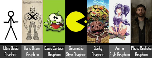
Game Graphics Styles

The list below documents some game using each of the graphics styles...
  • Ultra Basic Graphics - such as stick-man character game - stick-man.
  • Hand Drawn Graphics - Harold, Shank, Closure, Castle Crashers etc.
  • Cartoon Style Graphics - Angry Birds, Cut The Rope, Mario, Sonic etc.
  • Geometric Graphics - Pong, Tron, Pacman, Tetris, Bubble etc.
  • Quirky Graphics - Little Big World, Wego, Rhythm Heaven Fever etc.
  • Anime Graphics - Street Fighter, Pokemon, Suikoden, Tales Series etc.
  • Photo Realistic Graphics - LA Noire, Beyond Two Souls, GTA, Heavy Rain etc.
Can you think of any more? What category would your own games fall into?

Graphics Creation & Set-up:

Once you have decided on the style of graphics that you want for your game the next thing is to create them! If you need help with creating your 2D game graphics see our series of Photoshop Tutorials for guidance. The tutorial on how to use the pen tools are especially useful for creating suitable game graphics. If you do not have Photoshop then try the online photo and image editor Pixlr, it is an excellent and free alternative to Photoshop and has most of the same tools so you can also use it to follow the Photoshop tutorials we provide.

Create Graphics In Scratch...

When creating graphics it is important to know the best file size, file type and colour system to set them up in. As mentioned previously for this series of tutorials we will are recommending the freeware game engine Scratch as the best place to create your first 2D game. Scratch has a large library of graphics to choose from as well as an in built graphics editor which allows the creation of both bitmap and vector graphics. The interactive guide below (made using Scratch) explains how best to make graphics for your 2D game in Scratch.


Create Graphics In Photoshop or Pixlr...

If you still want to use a separate software such as Photoshop or an online editor such as Pixlr to make and import your own graphics to Scratch it is important to know uses a game screen size of 480 x 360 so all graphics should be created with this ratio in mind. For side scrolling, vertical scrolling or top down games graphics can be made in multiples of the 480 x 360 dimensions and then spit into sections before being imported into the game. See the example below.

The level graphics for a 2d side scroller game

Tip: Like with the character sprite sheet at the top of the page, some game objects will require multiple graphics in order to achieve the illusion of movement.

As games are made for display on screen they should be set up using the RGB (Red Green Blue) Colour System as opposed to the CMYK (Cyan Magenta Yellow Black) Colour System which is for printed graphics. In terms of file types, scratch will accept all the major file types so you need to consider which file type is best suited to each individual graphic. For example .JPG files are best for photographs while .GIF files are best for line drawings.

To help get your started here are 3 websites where you can source copyright free images/graphics to use in your 2d game.


Game Audio:

The game audio editor in Scratch

In gaming the Audio Engineer creates the soundtrack for a game. This might include music; sound effects to support the game action, such as gunshots or explosions; character voices and other expressions; spoken instructions; and ambient effects, such as crowd noise, vehicles or rain. The soundtrack helps to create a more immersive experience for the player by reinforcing the mood of the game. It can also enhance game play by affecting the tempo and adding emotional depth.

The importance of audio in games should not be underestimated. Background music will set the atmosphere in a game, while in game sound effects can shock or surprise the player, make us laugh or giggle, guide us to as whether an object is useful or harmful, to confirm an action has been processed, warn us of threats or hazards or just add to the in game experience.

Working to a creative brief, the Audio Engineer produces a sound design for the game and, when this has been agreed, realises it. This might involve the composing, scoring and recording of music. They are responsible for sourcing any sound effects that are needed, improving or creating them where necessary. These might be real or imaginary sounds, depending on the type of game. The Audio Engineer then edits, mixes, and masters the music and sounds to produce the soundtrack for the finished game.

Scratch allows for the recording of sounds through a microphone directly into the game and it also has a collection of audio songs and sound effects in it's media library but if what you need cannot be easily recorded or if something suitable in not available in the audio library then try one of the following audio download websites...


Next Up

Once you have created and/or gathered all the graphics and audio files that you need it is time to get programming your 2d game.


Baca selengkapnya

Create A 2D Game - Part 2: Game Objectives and Structure

Once you have settled on all the details of your 2D game idea you should next look to map out how the game will work. This will include listing the game objectives, identifying game controls, game menus and options, user interface layout, number of level, level maps, enemy A.I. and more.

All of these things must be clearly identified in order to be aware of the graphics you will require, the variety of sound effects you will want and the programming elements that will be needed in the next stages.

Main Game Objective:

Game Objectives Screen
You need to settle on the game's objectives as they are the driving force for the player in the game

First clearly and definitively write down the main objective of the game - you may already have done this using the worksheets in the previous section - and then outline how the player can achieve these objectives.

For example if the aim of the game is to collect coins, a la Sonic, then you also need to map out the location of these coins, the amount of coins, the number of coin types or costumes (for graphics), will there be a coin counting system, where will the counter be displayed, will that require a graphic, will there be a sound effect...? There are lots of questions to be answered so I recommend the use of quick annotated sketches to help make this process easier and faster.

Game Structure:

With the main objective of the game now fully explained and planned you can begin mapping out the structure of the game (how it will progress). The list below outlines a possible game structure....
  • Intro Scene  ↓
  • Game Menu  ↓
  • User Interface Layout - Health, Score, Timer, Inventory etc.  ↓
  • Level 1  ↓
  • Level 1 Boss Battle  ↓
  • Cut Scene  ↓
  • Level 2  ↓
  • Level 2 Boss Battle  ↓
  • End Scene  ↓
  • Game Credits

Note: Within your game structure certain sections will require more detail, planning and/or mapping out.

Game Menu:

2D game menu screen
A sample 2D game menu screen

The game menu will be the first point of contact for your players, it is important to provide them with all the information they need about the game in order to begin playing. This should involve creating a section in the menu where the game controls are explained. A section explaining the game story/plot is also recommended to help the player relate to the character they are playing as. A page in which the game options can be altered is also advisable to allow for things such as editing difficulty level, turning sound on/off or choosing a character to play as.

From a design point of view you should also identify the menu graphics and sound effects you will need. For example will you need a different background image for each menu section? How many buttons will you need? Will they have mouse over effects or sound effects? How will the game name/title be displayed?

From a programming point of view any editable options your menu allows for will have to be programmed into the game, this may involve the creation of extra variables or a different programming approach so they need to be decided upon at the outset as they may be very difficult, time consuming or even impossible to add into the game at a later stage.

For now you only need to sketch out possible layouts/designs for your game menu. The creation of and programming of it will be covered in the next sections.

User Interface:

2D game interface for a shooter game
A sample 2D game interface for a shooter game

After the game menu the next point of contact for the player is the game itself. At all points during the game the G.U.I. (Graphic User Interface) should be visible to allow the player to view important information associated with their status in the game. You must decide what this information should be and how it will be represented. For example the players health could be represented numerically, as a value between 0 and 100, or graphically ,through a health bar where red and green represent health or damage amounts. Below is a mock up of a possible user interface layout alongside a list of information which could be displayed on a User Interface...
  • Player Lives
  • Enemy Lives
  • Health
  • Score
  • Collected Items
  • High-score
  • Time
  • Ammunition
  • Selected Weapon
  • Inventory Items/Pack
  • Position/Map
As with the game menu, for now you only need to sketch out possible layouts/designs for your game's user interface. The creation of and programming of it will be covered in the next sections.

Level Map:

Once created the level map is a very useful document to have at your side throughout the rest of the 2D game design process. Your level map should be a detailed outline of your level including the 'landscape' of the level in terms of platforms, terrain or basically whatever the player is standing on or flying through. The position of enemies and obstacles and hazards should also be outlined on the level map to see potential impossible areas or to ensure there are no areas too hard/easy/boring. It should be possible to view the potential route the player will need to take or the actions the player will need to complete. It may be necessary to create 2 or 3 versions of your level map until you are happy that what you have created is interesting, appropriate and achievable.

The two examples below are from http://www.flickr.com/photos/dexteryy

Sample Level Map Version 1.0


Sample Level Map Version 2.0


Next Up...

Once you have completed the 2d game objectives and structure you should move onto the next step - 2D Game Graphics & Audio


Baca selengkapnya

Create A 2D Game - Part 1: Concept Development

Some random game concept development notes

The first step in creating a 2D game is to first settle on the idea for the game. It seems obvious but sometimes people waste a lot of time and effort by jumping into creating graphics and programming elements without knowing exactly what their game is actually about. The game idea - known as the concept - is extremely important and must itself be developed in great detail before progressing to the next stage. The concept stage can be broken down into three parts, idea generation, idea development and idea visualisation. Remember, the great thing about games is that anything you imagine is possible so set your imagination free!

Generate The Idea:

First things first then; you need to come up with an idea for your game. Idea generation is often called brainstorming but in reality brainstorming is just one type of idea generation. Brainstorming involves simply writing down as many ideas as possible as quickly as possible without considering their merit (whether they are good or bad). It is important not to think too much while doing this as logical or analytical thinking will restrict your creative mind.

Another idea generation technique is 'the random game' which involves creating headings of time, place, object and person/animal. You then give yourself a minute to write down as many things as possible under each heading. For example, under the 'time' heading you may write things like Jurassic period, iron age, 1960's, 2012, 2233, yesterday...etc. So after 4 minutes you should have 4 full categories which you can use to create a game idea, "but how?" you ask. The next part is the random part, simply take one word from each category at random and force yourself to put them into a scenario. Once again do this as quickly as possible without thinking to engage only the creative part of your brain. Remember, games are not real so anything goes!

If you still can't come up with anything, try out the following resources...

Develop the Idea:

Once you have your main idea the next step is to work out the details. For example, lets say you game idea is to play as...
A robotic turtle sent back from the future to the Jurassic period to find the first turtle and save him from assassination by your future enemies the golden kangaroos using a magic fork
Well I did say anything was possible. Despite having this brilliant idea in the bag there are still numerous questions that need to be answered. What will the game genre be, how many levels are there, what will the obstacles be, what will the game options be...? In order to help you develop your game idea we have developed some worksheets...


Visualise the Idea:


When creating a game you are often working as part of a team or working for a client or your boss. In any case you will need to create a game pitch to portray your game idea to someone else. As part of your game pitch you should also have some images to help visualise your idea. This may be through research images or photos showing the type of landscapes in which the game will be set, concept art or drawings showing what the characters will look like or internet images from existing games which are similar in style to what you are hoping to achieve. Whatever form you choose to use to represent your ideas visually does not matter the important thing is that you do represent them visually. Here are 3 options...

Create sketches and drawings to show your game concept
Find or take photographs to explain your game concept
Use Photoshop to create concept art for your game

It is not vital to have excellent drawing skills (although it wouldn't do any harm), the important thing is that you get your idea out of your head so you can show it to other people in order to get feedback or even just for yourself to see your idea in a physical form.

Career As A Concept Artist ...

Artists create the visual elements of a game, such as characters, scenery, objects, vehicles, surface textures, clothing, props, and even user interface components. Artists also create concept art and storyboards which help communicate the proposed visual elements during the pre-production phase.
Concept artists usually begin with traditional materials (eg pen and paper) and progress onto computer software.

The Concept Artist sketches ideas for the game worlds, characters, objects, vehicles, furniture, clothing and other content. They also suggest level designs, colour schemes, and the mood and feel of the game. They are usually very good at perspective drawing and architecture. Although not involved in creating the actual game art, their concept will determine the look of many aspects of the game.
For more information about concept artists click here.

Next Up...

Once you have completed these three parts of the 2D game concept development stage you should move onto the next step - Game Objectives & Structure


Baca selengkapnya

Create A 2D Game - Introduction

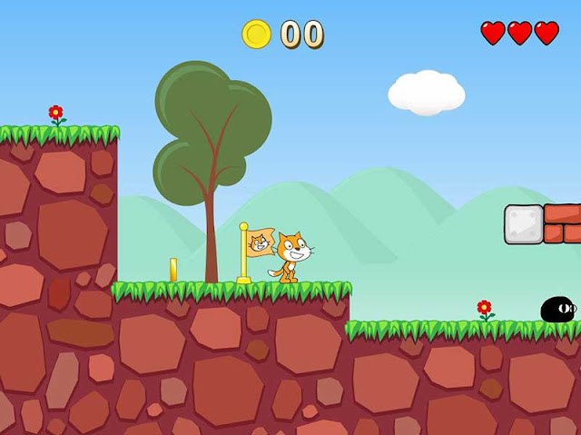
Screen shot from a 2D game made using scratch
This is a screen shot from a 2D game made using scratch by a user called GriffPatch

How To Design And Create A 2D Game

This 5 part series will guide you step by step through the stages of developing a 2D game. Two-dimensional games were most frequently developed in the early years of video games with the main reason for this being that the technical limitations of game hardware prevented the ease of creating three-dimensional graphics. When technology developed sufficiently to allow easier and more effective use of 3D graphics there was a temporary decline in 2D gaming. ( For more on games design history click here)

The wheel has now turned full circle however and the rise in popularity of mobile devices such as the iPad, iPhone and Android Phones are now mainly populated with easy to play 2D games. This renaissance in 2D gaming is partly due to the sentimental memories of early gamers joyously reliving their youth on their new gadgets. In reality though it is mainly a decision by developers to meet the demands of the consumers for quick, easy to play, fun games that they can pass 5 or 10 minutes with on the bus or train to work that 2d games are the ideal format.

These 2D games and Apps are made in a variety of ways including the Apple or Android SDK (Software Development Kit), Adobe Flash, HTML5 etc. However, if you are a games design student and are just starting out or you only want to make a game for fun or one to share with your friends then the best option is Scratch. Scratch is a simple, freeware game engine software that is easy to use, edit and publish so it can be easily shared with your friends.

The Scratch website hosts all the games made using it's editor and can sometimes put people off because of this as some of the games can appear childish or low quality (because they are made by children!). The reality is it is an excellent games engine for 2d game development and if you would like to see some examples of quality 2D games using Scratch then click here.

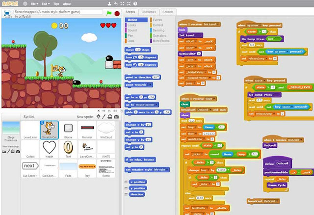
The Scratch 2D Game Engine Interface
The Scratch Game Engine Interface

Lets Get Started...

There are 5 main stages in the 2D games design process and this series will guide you through each one step by step. We will start with stage one - Game Concept Development.
Baca selengkapnya

Selasa, 29 Maret 2016

Games Design Process

Games Design Process
The Games Design Process

The computer games design process is based on the general design process but has a process which is solely focused around the area of computer games. The headings differ from those in the general design process but they are effectively the same steps just broken down further and retitled for a particular task. The overall process takes on the form of 3 major stages with each containing a subset of more specific stages. The stages are called pre-production, production and post-production. As the names suggest the processes central objective is the creation of the game. The stages are discussed in theory below and the application of this theory is explained through text and video tutorials on this website. Just use the search bar to find what you need.

Pre-production:

Analysis of Brief/Sector:

If you are designing a game for a client or for a college project you will be given a brief (set of instructions) that you will need to follow. Read these carefully and identify the key requirements that you need to fulfil. If you are designing the game for yourself then you will need to analyse the existing market, identify a gap or choose a game genre, engine and target audience. In this way you are creating your own brief.

Research:

Research is an important part of any design project and it will help you to identify possible software to use, genres to choose, ideas to develop, characters to animate and much, much more. It is also important to familiarise yourself with games already on the market as these will be the competition for your game and they will have set the standards that you need to meet or beat for your game to be successful.

Brainstorming: 

This is just a buzzword for idea generation and although the process may sound simple coming up with an idea for a game that is both original and interesting is very difficult. For example a FPS where a senile granny goes on a shooting rampage in a local park wearing a hospital gown, carrying two bags of shopping and shouting "quiet down!" may well be original but is it interesting to your target audience or even politically correct? I think not. This stage needs time and consideration; For help and assistance visit our article on idea generation.

Game Concepts/Objectives: 

Once you have decided on the basic idea for the game you then need to develop it further. What is it called? What are the characters called? What are they like? What is the objective of the game? How many levels? Where is it set? In what time is it set? All these questions and more need to be answered in order to develop a fully working, feasible and interesting game world that the player will want to get involved with and interact with.

Concept Art: 

Having decided on all the details, you then need to develop the style of the game. You will do this through concept art. Concept art demonstrates how the characters, terrains, building and objects will look. They may be in a cartoon style, a photo realistic style or anywhere in between.

Map development: 

Now that the details are in place and the style has been chosen, the layout of the game world must be considered. Is it a free roam map? Is it broken into territories or sections? Is it an island? These choices are yours to make (unless specified in the brief). This stage does not need to be too detailed and is merely intended as a basis for the main structure of the game.

Sketched Level Design: 

This stage develops on the level/game map and breaks it down into more detail. In these sketches you will sketch building plans, and map plans, level paths and more. These sketches will include the positioning of enemies, objects, pick-ups etc. It is a vital stage in the game design process as it the first and last time that you should be making actual game layout decisions which will directly affect the gameplay. You should base these decisions around the previous stages and the outcomes of your work during them.

Production:

Scale and Proportion:

Any game or level can appear huge or tiny depending on the scale of things relative to the character. As soon as you begin the production stage of your game, regardless of the software or game engine being used, you should place a character template or similar in the level to guide you in the correct scaling of your level.


Blocking out the Level:

This process is used to quickly layout the main sections and areas of a level. Each block may represent a building or cliff or vehicle or object etc. and doing this will allow you to quickly and easily get a sense of the environment you have created and make any necessary positional changes. It is also an ideal way to break down a large level into more manageable areas/blocks which can be detailed one at a time.


Adding Textures:

Textures should only be added after a level has been blocked out and all static meshes have been added. This is because textures are easier to edit and change than meshes and it is therefore better to match textures to meshes than vice versa. Most game engines will have a library of ready-made textures but creating your own is recommended as it will give your game a more original feel.

Adding Lighting: 

Lighting is one of the most important elements to a 3D game. Good lighting creates atmosphere, hides enemies, build tension for the player and makes a game look more realistic. Subtle changes and constant lighting rebuilds will take a lot of time so allow for that in your planning. Poor lighting cheapens a game, makes it look false and boring. Put in the time the time to get the rewards.

Adding Functionality and Interactivity:

As good as quality textures and feature lighting will make you game look unless it also has interesting and challenging elements for the player to interact with or use then it will not be successful. Things as simple as adding light switches and sliding doors add so much to a game by keeping the player constantly active as they roam around. More complex elements like elevators, vehicles, countdown clocks etc. will further enhance the player's experience.

Adding A.I.:

Artificial intelligence refers to elements in the game which can react to the players' movements, actions or decisions. They may be enemies or friendlies or other. Although complex to programme, once one is programmed correctly the same code can be used on an infinite amount of the same characters or only subtly edited for different characters.

Cinematics: 

These are short "movie" like interludes in the game used to inform the player on the game mission or objectives, give character information, hand out clues, show dialogue between characters etc. The reasons for using them are up to you but they are undoubtedly a great feature and add a sense of professionalism to your game while allowing the player a short respite from the action.


HUDs and Menus:

H.U.D. stands for heads up display and refers to the on screen game information which is displayed to assist or inform the player of what is happening. Items commonly displayed in the HUd are ammo, time, game map, health etc. The HUD needs to provide this information without intruding into the view of the player while playing the game, in most games the HUD can be toggled on/off. The menu is the first thing the player sees so it is great if it is interesting and enticing however the main function of the menu is of course to provide options for the player. Be sure your menu is clear and easy to use above all else.

Post-Production:

Testing: 

Once the game is packaged the process would appear to be complete but rigorous testing through gameplay is still required. Testing the game in the UDK editor as you go along is not sufficient to guarantee the game will be bug or glitch free. Many glitches are obvious after a few plays of the game and even if glitches are absent it is important to sure the game does not lag or freeze during certain elements of play.


Redesign: 

Based on the findings during the testing process various elements may need to be fixed or redesigned.

Packaging: 

Packaging the game refers to the act of compiling the game folders and files into an executable version of the game that others could download, install and play. Although this is one of the last stages its success is dependent on the correct set up of the level map and related files in the early stage of the production stages.

Promoting: 

Any game needs to be well promoted through eye-catching disc covers, DVD box packaging, internet ads, posters etc. Without good promotion, no matter how good the game is nobody will ever hear about it and therefore will never get the chance to play it. For help and assistance in creating the promotional graphics for your game visit our Photoshop and Illustrator tutorials.


What Next...

Now that you understand the theory why not try to apply this theory using the text and video tutorials in the UE4 section to guide you along the way. If you enjoyed this article then perhaps our articles on the webgraphicinterior or furniture design processes may also be of interest.


Baca selengkapnya

The Meaning of Colours

The colour wheel
The Colour Wheel

The Colour Wheel

Designers have a large range of colours at their disposal and most are well aware that certain colours are associated with feelings and emotions. Designers, companies and manufacturers use colours cleverly to promote a certain feeling about their products.
The interpretation of a colour depends on culture, profession, and personal preference. In general, the colours red, orange, and yellow are "exciting" colours and the colours purple, blue, and green are "calming" colours. It is very important to consider your target audience, the psychology of colour, and the image you wish to project before you construct your web-site, printed materials, and logo.

Primary Colours: 

These are colours that cannot be created through the mixing of other colours. They are colours in their own right.

The three primary colours are RED - YELLOW - BLUE.

Primary colours can be mixed together to produce SECONDARY COLOURS. 

Secondary Colours:

Secondary colours are made by combining two primary colours as shown below.

YELLOW + BLUE = GREEN
BLUE + RED = PURPLE
RED + YELLOW = ORANGE

The colour wheel can be seen above and this can be used to help remember primary and secondary colours. The secondary colours are in between the primary colours - for example - between red and blue is purple. Quite simply, mixing the primary colours of red and blue paint together will produce the secondary colour purple.


Complimentary Colours:

An important rule of the colour wheel is that colours opposite to each other on the colour wheel usually work well together as a colour scheme. These are known as complimentary colours. Complimentary colours are often used together in graphic design as they tend to give the image/graphic a sense of balance and are visually more aesthetic.

The Meaning Of Colours

Meaning of colours
The meaning of colours
The interpretation of a colour depends on culture, profession, and personal preference. In general, the colours red, orange, and yellow are "exciting" colours and the colours purple, blue, and green are "calming" colours. Interpretation of colour is not always a matter of personal preference. For example, in Western cultures the colour white symbolizes purity; however, in China the colour white symbolizes death.
  • Colour emphasizes, highlights, and leads the eye to important points or links.
  • Colour identifies recurring themes (i.e. titles and subtitles are usually the same colors).
  • Conversely, colour can differentiate, such as different colors in pie charts and bar graphs.
  • Colour symbolizes and triggers emotions and associations.

Colour Meaning Can Change With Context...

Colour can also work for your web site and printed materials in various other ways:
Colour meanings in context
The context can also effect the meaning and effect of a colour

Colours also have an effect on your visitors before they begin to read the content of your web site or printed design. Thus, it is very important for you to consider your target audience, the psychology of colour, and the corporate image you wish to project before you complete your design.

When colour is used correctly, it can add impact and clarity to your message and highlight important points. Alternatively When colour is used incorrectly, it can compromise your message and confuse your target audience. The diagram below outlines the main emotions associated with each of the main colours.

Conclusion

To summarise, it is very important to consider your target audience, the psychology of colour, and the image you wish to project before you construct your web-site, graphic design, printed materials or logo.
Baca selengkapnya

Jumat, 25 Maret 2016

7 Easy Ways To Speed Up Your Website

How to make your website load faster
Although it is unlikely you will make it to a perfect score the tips below can help you get in the green for page speed

As far back as 2010 Google admitted it uses a web pages loading speed as part of it's ranking algorithm and as the mobile web has grown so has the importance of a website's loading speed. So with that said let's get to the point. Here are my top tips to speed up your web pages...

Go Direct...

No landing page redirects please. Why? Well redirects trigger an additional HTTP request-response cycle and delay page rendering. In the best case, each redirect will add a single round-trip (HTTP request-response), and in the worst it may result in multiple additional round-trips to perform the DNS lookup. So you should therefore minimize your use of redirects where possible.

Google identifies these examples of redirect patterns...
  • example.com uses responsive web design, no redirects are needed - fast and optimal!
  • example.com → m.example.com/home - multi round-trip penalty for mobile users.
  • example.com → www.example.com → m.example.com - very slow mobile experience.

Cut The Crap...

Remove any unnecessary content, especially widgets and plugins that you only put into your sidebar or footer to fill it out, yes I'm looking at you! Only present that content that is actually relevant or related to the web page's topic.

WordPress sites especially, tend to have sidebars or footers full of widgets or plugins that are serving no real purpose but yet are slowing down your webpage a lot. "But they are so easy to add and they look really pretty..." I hear you say. That may be true but are they actually serving a purpose? If not, get rid of them.

Tip: If you want/need to link to Twitter, Facebook, Google +, Pinterest etc. just use a linked icon (font awesome icons are great for this) or image as opposed to a widget or plugin.

Prioritise Above The Fold

What we mean by this is that you should limit the size of the data (HTML mark-up, images, CSS, JavaScript) that is needed to render the above-the-fold content of your page. Structure your page so the initial response from your server sends the data necessary to render the critical part of the page immediately and defer the rest. This may mean that you must split your CSS into two parts: an inline part that is responsible for styling the above the fold portion of the content, and the part that can be deferred.

Google suggests the following examples of how a site could be restructured to load faster:
  • If your HTML loads third-party widgets before it loads the main content, change the order to load the main content first.
  • If your site uses a two-column design with a navigation sidebar and an article, but your HTML loads the sidebar before the article, consider loading the article first.

Optimise Images

It really is amazing how much you can reduce image file sizes without any loss of quality. You literally can't see any difference visually but the impact on web page loading speeds can be immense. Here are 2 options for software to help you optimise your websites images.

Minify, Minify, Minify

That heading isn't for dramatic effect as you can, and should, minify your HTML, CSS and JavaScript. This is actually a lot easier than you think. It basically means removing any unnecessary spaces from your HTML, CSS and JavaScript code. There are even lots of websites that will do it for you for free, my personal favourite due to it's beautiful simplicity is this minifier.


Enable Compression

The word compression tells you all you need to know about what this does but how does it work? All modern browsers support and automatically negotiate gzip compression for all HTTP requests. Enabling gzip compression can reduce the size of the transferred response by up to 90%, which can significantly reduce the amount of time to download the resource, reduce data usage for the client, and, most importantly, improve the time to render of your pages. See Google's explanation of text compression with GZIP to learn more.

Good News: If you have a Blogger website then you automatically have gzip compression. If you don't believe me then test your website's compression.

Bad News: Some other hosting providers' basic hosting package do not support compression so be sure to check before you waste your time and effort working on it.


Browser Caching

Caching involves storing information from your website for reuse. Fetching information over the network is both slow and expensive: large responses require many round-trips between the client and server, which delays when they are available and can be processed by the browser, and also incurs data costs for the visitor. Therefore, the ability to cache and reuse previously fetched resources will optimize performance and speed up your website. The most common way to leverage browser caching for increased page loading speed is using a .htaccess file.

Learn how to leverage browser caching.

Tip:  If your website is hosted by Blogger you cannot use browser caching through the .htaccess method as you have no access to the .htaccess file. However you can try this alternative.


Baca selengkapnya

Selasa, 22 Maret 2016

CSS Positioning and Layering

CSS Positioning
CSS positioning is a lot more advanced than just top, middle or bottom!

CSS Positioning

With CSS positioning, you can place an element exactly where you want it on your page. Together with floats, positioning gives you many possibilities to create an advanced and precise layout. To help us understand imagine a browser window as a system of coordinates, as in the image below.

Browser window screen coordinates for use with CSS Positioning

The principle behind CSS positioning is that you can position any box anywhere in the system of coordinates. Let's say we want to position a headline. By using the box model we can make a headline appear as follows...


If we want this headline positioned 100px from the top of the document and 200px from the left of the document, we could type the following in our CSS:


The result will be as follows...

CSS Positioning
CSS Positioning

As you can see, positioning with CSS is a very precise technique to place elements.

Note: The element is positioned from its top left corner.

Absolute or Relative Positioning

There are two types of positioning, absolute and relative. In the sample above we used absolute positioning . An element which is positioned absolute does not obtain any space in the document, which means that it does not leave an empty space after being positioned. To position an element absolutely, the position property is set as absolute. You can subsequently use the properties left, right, top, and bottom to place the box. As an example of absolute positioning, the CSS code below would place 4 boxes in each corner of the browser window.


The difference between absolute and relative positioning is that for an element which is relatively positioned the position is calculated from the original position of the element in the document.

To position an element relatively, the property position is set as relative. That means that you move the element to the right, left, up or down. This way, the element still obtains a space in the document after it is positioned. An example code is shown below...


Tip: When using positioning it is recommended that you use either all absolute positioning or all relative positioning, mixing the two types can lead to problems, especially when the page is being viewed in different browsers. In my opinion it is best to use relative positioning, but don't just trust me try it out for yourself.

CSS layering with z-index

CSS operates in three dimensions, height, width and depth. In this lesson, we will learn how to let different elements become layers. This means we will be able to let elements overlap one another. To do that, you can assign each element a number using the CSS property z-index. The element with a higher number overlaps on top of an element with a lower number. Let us say we are playing poker and have a royal flush. Our hand can be presented in a way where each card has got a z-index:


The CSS code in the  example above would result in something like this...

CSS layering with z-index

The method is relatively simple but the possibilities are numerous. You can place text over images or text above text etc. Try it yourself to create effects in headlines or banners.

Next Up

Our ten steps to learning CSS has come to an end but we have a treat in store will a selection of CSS resources just for you coming soon. (sign up to our newsletter to be first to hear about their release)

http://www.onlinedesignteacher.com/2016/03/css-positioning-and-layering.html
Baca selengkapnya

CSS Floating

CSS Floating
The basic principles of CSS floating are displayed in this simple diagram

Floating elements with CSS

Any HTML element or <div> block can be floated to the right or to left by using the property float. That is to say that the <div> block or element, including its contents, either floats to the right or to the left in a document (or another containing box). The content which follows will fill the gap left behind. Float can be set as either left, right or none. The following figure illustrates the general principle in a little more detail than the on above.

CSS Float
CSS float in action

If, for example, we would like to have text wrapping around a picture we could float the image to the left and the following content would fill the gap (thus wrapping around it). The result would be like this...

Floating elements with CSS
CSS float example

The HTML code for the example above, look as follows:


To get the picture floating to the left and the text to surround it, you only have to define the width of the box which surrounds the picture, so none of the image is cut off, and then set the property float to left:


Floats can also be used to create columns in a document. To create two columns, you simply have to structure the desired columns in the HTML code with <div> as follows.


Now the desired width of the columns is set to 50%, and then you simply float each column to the left by defining the property float. Try it out for yourself.


Clear (Stop filling after floating)

The clear property is used to control how the elements following floated elements in a document behave. By default, the subsequent elements are moved up to fill the available space which will be freed up when a box is floated to the side. The property clear can assume the values left, right, both or none. The principle is, if clear, is set to both for a box, the top margin border of this box will always be under the lower margin border for possible floating boxes coming from above. In other words, it won't fill the gap left behind.


To avoid the text from floating up to fill the gap and sit next to the picture, we can add the following CSS, Try it out for yourself.


Next Up

Floats are useful in many situations and will often be used together with positioning. In the next section we will take a closer look at how to position html elements using CSS. There are two main types of positioning, relative and absolute, both are explained.


Baca selengkapnya

CSS Padding, Borders and Margin

CSS Padding, Borders and Margin

Margin and Padding:

Now let's look at how you can use your knowledge of the box model to change the presentation of elements by setting the margin and padding properties as shown in the above example.

An element has four sides: right, left, top and bottom. 
The margin is the distance from each side to the neighbouring element or the outer borders of the document. As the first example, we will look at how you define margins for the document itself i.e. for the element <body>. The illustration below shows how we want the margins in our pages to be.

CSS Margins
CSS Margins

The CSS code for the above page would look like this,


Or, like background and font, you could compile the CSS code using just margin. Margin recognises the values in the order top, right, bottom, left.


You can set the margins in the same way on almost every element. For example, we can choose to define margins for all of our text paragraphs marked with <p>:


Padding can also be understood as 'filling'. This makes sense as padding does not directly affect the distance of the element to other elements but rather defines the inner distance between the border and the content of the element.

The usage of padding can be illustrated by looking at a simple example where all headlines have background colours. By defining padding for the headlines, you change how much filling there will be around the text in each headline. Try out the code below yourself and see what it looks like.


Borders

Borders can be used for many things, for example as a decorative element or to underline a separation of two things. CSS gives you endless options when using borders in your pages.

border-color

The width of borders is defined by the property border-width, which can obtain the values thin, medium, and thick, or a numeric value, indicated in pixels. The image below illustrates the system.

CSS Borders
CSS Borders

border-color

The property border-color defines which colour the border has. The values are the same as with the normal color-values for example "#123456", "rgb(123,123,123)" or "yellow".


border-style

The property border-style defines which type of border the element has. There are numerous different types of borders to choose from. Below 8 different types of borders are demonstrated, all the examples are shown with the colour "gold" and the thickness "thick" but can be shown in other colours and thicknesses.

CSS Border Styles
CSS Border Styles

CSS Border Samples

Let's look at some sample CSS codes, try these out yourself to see how they look.


It is also possible to state special properties for the top, bottom, right or left borders. The following example shows you how:


As is the case with many other properties, you can compile many properties into one using border. Let us take a look at an example:


Can be compiled into:


Next Up

In the next lesson we will learn how to float html elements using CSS.


Baca selengkapnya

CSS Box Model

The CSS Box Model
The CSS Box Model

The CSS Box Model

The box model in CSS describes the boxes which are automatically generated for all HTML-elements and which you can control using CSS. The box model contains detailed options regarding adjusting margin, border, padding and content for each element. The diagram below shows how the box model is constructed. The illustration above is purely theoretical, so let's try to put this new information into practice.


By utilising our knowledge of the box model and adding some CSS (examples to follow) to the previous HTML the example could be presented as follows...

CSS Box Model Example


The image below shows how each HTML element is surrounded by boxes which we can adjust using CSS.

CSS Box Model Example
The numbers around the areas are the margin and padding values

Height and Width

The height and width of each element or 'box', as represented by the box model can also be edited using CSS. In this section, we will take a look at how you easily can define the height and width of an element. With the width-property, you can define a certain width of an element. The example below sets the width of a <div> with a class value of 'box' to 200px.


In the example above as we did not specify a height, the height of the box will be set by the content of the box. You can of course set the height of an element with the property height if you wish.

As an example let us try to make the box in the previous example 500px high:


Tip: If you set the height or width to a value too small the content may prevent the code from working or in other cases some of the content will disappear. To ensure neither of these thing happen use the code overflow:auto. This will create a scroll bar on the right side of the div block so you can scroll up or down to view the content while still retaining the height and width you set. See the example below.

Next Up

In the next lesson we will look at examples for the padding, border and margin that we have identified as part of the box Model.


Baca selengkapnya

CSS Class and Id

CSS Class and Id with div and span
class and id work together with div and span to help you make the most of your CSS

This section on CSS actually focuses on the use of HTML attributes 'class' and 'id' and the HTML elements <div> and <span>. These are very important if you are to use CSS effectively as they hold the key to giving you complete control over every aspect of your website.

Class

Sometimes you want to apply a special style to a particular element or a particular group of elements and yet not every single element of that type! Confused? Don't be. Let's say that we have two lists of links to different grapes used for white wine and red wine. The HTML code could look like this:


What if we want the white wine links to be yellow, the red wine links to be red and the rest of the existing links on the webpage to stay blue? To achieve this, we first need to divide the links into two categories using the HTML attribute 'class'.

So we assign a class to each link using the HTML attribute class. We use class instead of id as class is used for multiple or group effects while id is used for single or individual effects. Let us try to specify some HTML classes from the example above:


We can then define special properties for links belonging to white wine and red wine, respectively by using .classname after the element it was used on (in this case 'a') in the style sheet of the document.


The above CSS code combined with the HTML shown earlier will result in the following...

This is a normal link

Grapes for white wine:

Grapes for white wine:

Id

In addition to grouping elements with class, you might need to identify one unique element. This is done by using the attribute id. What is special about the attribute id is that there cannot be two elements in the same document with the same id. Each id has to be unique. Now, let us take a look at an example of a possible usage of id:


The above could be headings of any document split into chapters or paragraphs. It would be natural to assign an id to each chapter as follows:


Let us say that the headline for chapter 1.1 must be in red. As shown in the example below you must define the properties in a specific element by using #id in the stylesheet of the document.


The above CSS combined with the previous HTML would result in something like the following...

Chapter 1

Chapter 1.1

Chapter 2

Chapter 2.1


Div and Span

The HTML elements <span> and <div> are used to group and structure a document and are usually used together with the attributes class and id. The difference between div and span is that <span> is used within an element (inline) while <div> is used to group one or more elements (block-level).

Span

In My Honest Opinion, <span> is not the most useful of elements as it is only used inline so it is often easier to use basic HTML code to format the part of the element (usually text within a paragraph) that you want to edit. However, with my little rant over, let's look at an example of <span> in use. Let's take a famous Benjamin Franklin phrase.


Let's say we want what Mr Franklin sees as the benefits of not sleeping your day away emphasized in red. For that purpose, we can mark the benefits with <span>. Each span is then added a class, which we can define in our style sheet:


In order to make those tagged words red then the CSS code would simply be...


The result would be....

Early to bed and early to rise makes a man healthy, wealthy and wise.

As mentioned earlier this is a bit long-winded for something that could have been done using the HTML <font color='red'>. Anyway not to worry, as you probably won't be using <span> too often. One element you definitely will be using though is <div>, so let's look at how it is used.

Div

As mentioned earlier while <span> is used within a block-level element, <div> is used to group one or more block-level elements. Aside from this difference, the grouping with <div> works in the same way. Let us take a look at an example with two lists of relatively recent U.S. presidents divided into their political affiliations:


And in our style sheet, we can utilize the grouping in the exact same way as above:


The above CSS code combined with the previous HTML would result in something like this...

  • John F. Kennedy
  • Lyndon B. Johnson
  • Jimmy Carter
  • Bill Clinton
  • Barack Obama

  • Richard Nixon
  • Gerald Ford
  • Ronald Reagan
  • George Bush
  • George W. Bush

These examples for <div> and <span> are very basic and are only intended to show you how to link the HTML elements with the associated CSS code. We will now look at the 'box model' which, when used with <div> and <span> and class and id, will really open up your design and layout possibilities with CSS.

Next Up

In the next lesson we look at the CSS Box Model which explains the details of how each HTML element is structures.


Baca selengkapnya