 |
| There are literally thousands of fonts to choose from so it's important to know the difference. |
Why Care About Fonts?
Choosing the right type of font to use in a design is more important then you may think. Font size is a very important aspect that must also be taken into consideration. When choosing a font size, one should keep in mind that choosing sizes closer to one another for various levels within your site will output a more professional and elegant webpage. Font emphasis is also an important factor as not only will font emphasis aid in search engine optimization, it also alerts viewers to what is important on a page or where the links are located. Search engine spiders look for phrases that are either in bold, highlighted or between header tags. These phrases are deemed as important. One can therefore control keywords by placing them in bold or italics.
All of these issues need to be taken into account with every website. Choosing the proper text is vital to readability as well as accessibility. However before we can make any of these types of decisions it is important to first understand fonts and all the terminology around fonts in more detail.
All of these issues need to be taken into account with every website. Choosing the proper text is vital to readability as well as accessibility. However before we can make any of these types of decisions it is important to first understand fonts and all the terminology around fonts in more detail.
The Basic Font Terms...
There are two types of names used to categorise fonts: "generic families" and "family names". Both terms are explained below.
Generic Family Fonts:
Generic families can best be described as groups of family-names with uniformed appearances. An example is sans-serif, which is Latin for without feet. In this instance 'feet' refers to the small base lines that are seen on the bottom of a letter. So sans serif is a font family which is a collection of fonts where the letters do not have 'feet'. Then there are serif fonts which have 'feet' and finally there are the more obviously named mono-space fonts which are characterized by all letters/characters having a fixed width.Font Family Names:
Examples of a family name (often simply known as "font") can e.g. be "Arial", "Verdana", "Times New Roman", "Courier", "Calibri" or "Tahoma".The difference is also explained in the illustration below.
Choosing An Appropriate Font
In design, especially web design and graphic design, fonts play an important part in the success and overall aesthetic of your design image/project. Different fonts suggest different styles and have different connotations attached to them. For example the font below, taken from www.dafont.com is a horror style font. It suggests bloodshed, gore, monsters and vampires etc. You would expect to see it used for a horror movie poster or something similar. On the other hand you would not expect to see it used for the logo on a children's creche! | ||
|
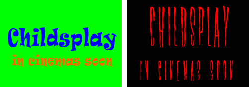
This is obviously quite a severe example of a font style but even more subtle fonts will have an impact on the impression the viewer gets from the overall image. So carefully consider the font style and colour you use in all your designs.The example below shows how different fonts and colours project different styles for a design. The left image looks childish, cartoony and fun while the right suggests gore, horror and danger even though the words are the same in both.
 |
| The style and colours of fonts can have a big effect on how we interpret the meaning of a design |
Font Readability...
Other considerations with regard to choosing a font include "readability", in other words, how easy a font is to read. In terms of web design the recommended font size to use is either 14 or 16 pixels for body text. This website uses 16px, hope you can read this OK.Script style fonts can be very fancy but are also generally hard to read. Using them for a heading might be suitable but using them as a body text ( for a large amount of text) certainly would not be. For example try to read the text below! Not easy is it?
 |
| Can You Read This...? |
In general sans-serif and mono-space fonts are easier to read. While serif fonts are a little more "fancy". Although with the ever expanding library of original fonts continuing to expand online on websites such as www.dafont.com there are really no set rules to choosing a font.
My advice is try out as many as possible while keeping in mind the style you want to get across in your image/design/project. If you wish to look into it further here are some recommended links to other sites which explore the issue of how to choose a font.
I hope you found this useful. Feel free to share any comments you have or recommend any fonts or font websites.
Bagikan
Which Font Should You Use?
4/
5
Oleh
SEM


