Senin, 30 November 2015

Which Font Should You Use?

Selecting Fonts
There are literally thousands of fonts to choose from so it's important to know the difference.

Why Care About Fonts?

Choosing the right type of font to use in a design is more important then you may think. Font size is a very important aspect that must also be taken into consideration. When choosing a font size, one should keep in mind that choosing sizes closer to one another for various levels within your site will output a more professional and elegant webpage. Font emphasis is also an important factor as not only will font emphasis aid in search engine optimization, it also alerts viewers to what is important on a page or where the links are located. Search engine spiders look for phrases that are either in bold, highlighted or between header tags. These phrases are deemed as important. One can therefore control keywords by placing them in bold or italics.


All of these issues need to be taken into account with every website. Choosing the proper text is vital to readability as well as accessibility. However before we can make any of these types of decisions it is important to first understand fonts and all the terminology around fonts in more detail.

The Basic Font Terms...

There are two types of names used to categorise fonts: "generic families" and "family names". Both terms are explained below.

Generic Family Fonts:

Generic families can best be described as groups of family-names with uniformed appearances. An example is sans-serif, which is Latin for without feet. In this instance 'feet' refers to the small base lines that are seen on the bottom of a letter. So sans serif is a font family which is a collection of fonts where the letters do not have 'feet'. Then there are serif fonts which have 'feet' and finally there are the more obviously named mono-space fonts which are characterized by all letters/characters having a fixed width.

Font Family Names:

Examples of a family name (often simply known as "font") can e.g. be "Arial", "Verdana", "Times New Roman", "Courier", "Calibri" or "Tahoma".


The difference is also explained in the illustration below.

The image above explains the difference between generic families and individual font name

Choosing An Appropriate Font

In design, especially web design and graphic design, fonts play an important part in the success and overall aesthetic of your design image/project. Different fonts suggest different styles and have different connotations attached to them. For example the font below, taken from www.dafont.com is a horror style font. It suggests bloodshed, gore, monsters and vampires etc. You would expect to see it used for a horror movie poster or something similar. On the other hand you would not expect to see it used for the logo on a children's creche!


Appropriate for a scary movie...
This is obviously quite a severe example of a font style but even more subtle fonts will have an impact on the impression the viewer gets from the overall image. So carefully consider the font style and colour you use in all your designs.The example below shows how different fonts and colours project different styles for a design. The left image looks childish, cartoony and fun while the right suggests gore, horror and danger even though the words are the same in both.

The style and colours of fonts can have a big effect on how we interpret the meaning of a design


Font Readability...

Other considerations with regard to choosing a font include "readability", in other words, how easy a font is to read. In terms of web design the recommended font size to use is either 14 or 16 pixels for body text. This website uses 16px, hope you can read this OK.

Script style fonts can be very fancy but are also generally hard to read. Using them for a heading might be suitable but using them as a body text ( for a large amount of text) certainly would not be. For example try to read the text below! Not easy is it?


Can You Read This...?

In general sans-serif and mono-space fonts are easier to read. While serif fonts are a little more "fancy". Although with the ever expanding library of original fonts continuing to expand online on websites such as www.dafont.com there are really no set rules to choosing a font.

My advice is try out as many as possible while keeping in mind the style you want to get across in your image/design/project. If you wish to look into it further here are some recommended links to other sites which explore the issue of how to choose a font.

I hope you found this useful. Feel free to share any comments you have or recommend any fonts or font websites.


Baca selengkapnya

What File Type Should I Use...?


Digital file types
Choosing the right file type can be more important than you think

The Basics...

There are many different file types used to encode digital images. JPG, GIF, TIFF, PNG, BMP, PDF and PSD are just a few. But what are they, what do they stand for and what are the differences? Part of the reason for the variety of file types is the need for compression. Image files can be quite large, and the larger the file the more disk space it uses and the slower it is to download. Compression is a term referring to the ways of reducing the size of a file. Another reason for the variety of file types is that images differ in the number of colours they contain. Therefore if an image is made up of only a few colours, a file type can be designed to use this as a way to reduce the file size.

Compression schemes can be either lossy or lossless.


A lossless compression does not discard any information. It attempts to represent an image in a more efficient way, while making no compromises in accuracy. In contrast, lossy compression allow some reduction in the image quality in order to achieve a smaller file size. Here I discuss the basic features of a 7 common file types.


PDF

PDF (Portable Document Format) was invented by Adobe Systems and due to the worldwide use of Adobe programs and the free and easy availablity of the Adobe Reader PDF has become the global standard for capturing and reviewing rich information from almost any application on any computer system and sharing it with virtually anyone, anywhere. There is also a guarantee that the original image will remain unchanged, unedited, uncompressed when opened after it has been e-mailed or downloaded which is ideal when sending or sharing graphic design files where layout, colours and image quality are so important.

PDF is a formal open standard known as ISO 32000. Maintained by the International Organization for Standardization, ISO 32000 will continue to be developed with the objective of protecting the integrity and longevity of PDF, providing an open standard for the more than one billion PDF files in existence today.

Back to Top


JPG

JPG (Joint Photographic Experts Group) is optimized for photographs and similar continuous tone images that contain many, many colours. For this reason all digital cameras save in a JPG format by default. It can achieve excellent compression ratios while still maintaining very high image quality. JPG works by analyzing images and discarding kinds of information that the eye is least likely to notice. It stores information as 24 bit colour. JPG is the most popular format for nearly all photographs uploaded to the internet.

Never use JPG for line art. In these type of images where there are areas of uniform colour with sharp edges, JPG does not perform well. For these type of images GIF and PNG are better suited.

Back to Top


PSD

PSD (PhotoShop Document) is the format used by the graphics program Photoshop. This is the preferred working format as you edit images in the software, because only this format retains all the editing power of the program. Photoshop uses layers, filters and effects to build complex images, and layer information may be lost in other formats such as GIF and JPG. PSD files need to be much larger than other file formats in order to store all this information. For this same reason, however, be sure to save your end result as a standard GIF or JPG, or you may not be able to view it when your software has changed but moreover you cannot use PSD files for web images or in animation programs.

Back to Top


TIFF

TIFF (Tagged Image File Format) is a very flexible format that can be lossless or lossy. Although normally TIFF is used almost exclusively as a lossless image storage format that uses no compression at all. Most graphics programs that use TIFF do not compress and as a result file sizes can be quite big.

Some digital cameras often offer TIFF as am output option as well as the default JPG. TIFF is usually the best quality output from a digital camera as JPG always results in at least some loss of quality. However, the file size of TIFF is huge. A more important use of TIFF is as a working storage format as you edit and manipulate digital images in a photo editing programme such as Photoshop. TIFF can save the different image layers that you have been editing while JPG can only save the file as a single flat image. Also when you go through several load, edit, save cycles with JPG storage, the image quality degrades each time. TIFF is lossless, so there is no degradation associated with saving a TIFF file.

On the downside TIFF files should not be used for web images as the file size is so large that they take a long time to load and some browsers will not even render them

Back to Top


PNG

PNG (Portable Network Graphics) is a lossless storage format. In contrast with common TIFF usage, however, it looks for patterns in the image that can be used to compress the file size without the loss of any quality. The compression is exactly reversible, so the image is recovered exactly.

PNG is becoming increasingly popular as it is superior to GIF and JPG depending on the situation. PNG produces smaller files and allows more colors than GIF and PNG also supports partial transparency. Partial transparency can be used for many useful purposes, such as fades and antialiasing of text.

In terms of superiority to JPG if you want to display a photograph exactly without loss on the web, PNG is your choice. All modern web browsers support PNG, and PNG is the only lossless format that all web browsers support.

Back to Top


GIF

GIF (Graphics Interchange Format) images create a table of up to 256 colours from a selection of 16 million. If the original image has fewer than 256 colours, GIF can render the image exactly but when the image contains more than 256 colours, software that creates the GIF uses any of several compression algorithms to approximate the colours in the image with the limited palette of 256 colours available. For this reason do not use GIF for photographic images, since the restriction of 256 colours per image is much too low for a decent quality photograph.

GIF achieves compression in two ways. Firstly, it reduces the number of colours in colour-rich images, therefore reducing the number of bits needed per pixel. Secondly, it replaces reoccurring patterns with a short abbreviation: instead of storing 'white, white, white, white, white,' it stores '5 white'. Thus, GIF is 'lossless' only for images with 256 colours or less. For a rich, true colour image, with more than 256 colours GIF could lose up to 99% of the colours.

Back to Top


BMP

BMP (Bitmap), also known as Device Independent Bitmap (DIB) file format or simply a bitmap, is a raster graphics image file format used to store bitmap digital images, independently of the display device such as a graphics adapter, especially on Microsoft Windows and OS/2 operating systems. The BMP file format is capable of storing 2D digital images of any width, height, and resolution, both monochrome and colour, in various colour depths, and optionally with data compression, alpha channels, and colour profiles.

The simplicity of the BMP file format, and its widespread familiarity in Windows and elsewhere, makes it a very common format that image processing programs from many operating systems can read and write. Many older graphical user interfaces used bitmaps in their built-in graphics sub-systems.

While most BMP files have a relatively large file size due to lack of any compression, many BMP files can be considerably compressed with lossless data compression algorithms such as ZIP, where in extreme cases of non-photographic data they can be reduced to just 0.1% of original size, because they contain redundant data. Some formats, such as RAR, even include routines specifically targeted at efficient compression of such data.

Back to Top


NOTE:This list only documents the most common file formats and is not an extensive file format list. I do however intend to add to it in the near future


Baca selengkapnya

Kamis, 26 November 2015

Colour Schemes

Before reading this section it is recommended that you first read the section on colour theory as a basic understanding of colour related terminology is expected.


Colour Schemes for Graphic Design
With so many colour variations to choose from settling on a colour scheme can be difficult

A colour scheme is a combination of colours that, when put together, compliment or contrast one another in an aesthetically pleasing way. Colour schemes are used by artists, graphic designers and interior designers to create visually appealing imagery. Colour schemes can be put together at random, but most professionals choose colours based on their relationship to each other in the colour wheel. The colour scheme types explained here are monochromatic, primary, secondary, complimentary, analogous, triadic, warm and cool.


Monochromatic colour scheme:

Poster with a monochromatic colour scheme

A monochromatic colour scheme is made up of just one main colour, but features a number of shades of that one colour. A simple example of this would be a colour scheme of blue, dark blue and light blue, as seen below. Monochromatic colour schemes could also feature the base colour, shades of that colour, and white and black.

Sample Monochromatic colour swatch


Primary Colour Scheme:

Poster using primary colours

This is another basic type of colour scheme where the basic primary colours of red, yellow and blue are used. A primary colour scheme can be made up of any shade of each primary colour but works best when the shades match evenly. In other words don't mix a bright red with a muted blue and yellow.

 Sample Primary colour scheme


Secondary Colour Scheme:

Image with a secondary colour scheme

This is a type of colour scheme where the secondary colours of purple, green and orange are used. A secondary colour scheme can be made up of any shade of each secondary colour but works best when the shades match evenly. In other words don't mix a bright purple with a muted green and orange.

Sample Secondary colour scheme


Complimentary Colour Scheme:

This images uses the complimentary colours of blue and orange

This colour scheme involves matching a primary colour with the secondary colour opposite to it on the colour wheel. For example, a colour scheme based on shades of yellow and purple would comprise a complimentary colour scheme, as seen below. Other complimentary colour pairs are blue with orange and red with green.

Sample Complimentary colour scheme


Analogous Colour Scheme:

Poster using an analogous colour scheme

An analogous colour scheme is created by pairing colours that appear side by side on the colour wheel. For example, an analogous colour scheme may include purple, blue and green. More subtle combinations may also be created by matching mixed colour tone combinations such as blue-purple, blue and blue-green, as seen below.

Analogous colour scheme


Triadic Colour Scheme:

This graphic design images uses a triadic colour scheme

A triadic colour scheme is made up of three colours spaced evenly apart from each other on the colour wheel. The primary colour scheme made up of the primary colours--red, yellow and blue is an example of this. These colours are all an equal distance from each other on the colour wheel, and form a triangle on the colour wheel when connected to each other. To produce a different triadic colour scheme, move the triangle until it points to different colours on the colour wheel such as yellow, red-purple and blue-green.

Triadic colour scheme


Warm Colour Scheme:

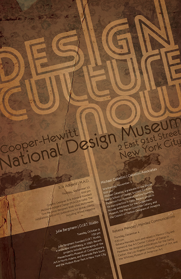
This movie poster uses a warm colour scheme


The colour wheel is divided into two halves, warm colours and cool colours. The warm colours include reds, oranges and yellows, including all variations of these colours. The warm colours are associated with action, passion, love, rage, danger and heat.

Warm colour scheme

Cool Colour Scheme:

This movie poster uses a cool colour scheme

The cool colours are found on the opposite side of the colour wheel, and these colours include all blues, greens and purples. Cool colours are associated with coolness, peace, calm, depression,
sadness, sky and water.

Cool colour scheme


Baca selengkapnya

Our Top 3 Idea Generation Techniques

Idea Generation Techniques
Coming up with ideas is tough so here are our top 3 idea generation techniques

As mentioned in the design process section coming up with an idea for a design, a slogan for a campaign, an image for a poster, a name for a website etc. can be difficult. However, by focusing on fulfilling the key requirements of the brief and allowing your research to inspire you it is possible to generate original designs for your project. Here we discuss our top 3 idea generation techniques.

Brainstorming:

Brainstorming can be useful but only if you relax and let the ideas flow, don't over think things

Brainstorming is often used where a lack of ideas is a problem. There are numerous approaches and theories on brainstorming and the different types and their levels of success are open to interpretation. In design, like many other things, different approaches suit different people and it is up to you to test out some of the brainstorming techniques and decide for yourself which one best suits you.

There is already a large amount of existing resources and lists on brainstorming techniques so it would be fruitless to repeat another one here, instead a selection of recommended links are listed below for your examination. Everyone is different and different different techniques work for different people so browse through all the links below and find a brainstorming approach that works for you - and then stick to it!


Mind Mapping:

A mind map is a diagram used to visually outline information. A mind map is often created around a single word or text, placed in the centre, to which associated ideas, words and concepts are added. Major categories radiate from a central node, and lesser categories are sub-branches of larger branches. The image below is a mind map which is explaining mind maps!


Sample Mind Map


This can be a useful technique when you want to come up with ideas, images, words or anything that you can associate with a particular theme, perhaps given to you by a client. You pre existing connotations of a word, place or colour tend to come out in a mind map easier than they might in a discussion on the topic.

Random Idea Game:

This is my personal favourite, probably because it is the most fun to do. One thing is certain with this technique is your ideas will be original.

What you do will differ slightly depending on the type of idea you need but basically create 5 columns with the headings time, place, person, object and animal. Then as quickly as possible, so as to prevent over-thinking, write down 10 to 15 related items in each column. For example in the time column you could write down anything from 2.45pm to the year 2099 or in place it could range from the corner of your living room to the forest moon of endor! All items can be real or imaginary so don't think just write.

Once you have done that the fun can begin. At random choose one item from each column at random (as quickly as possible) and force yourself (again as quickly as possible) to create a scenario/scene/story that involves them all. You will get some truly weird and wonderful ideas that you can then use as settings for a computer game, the basis of a novel, an image for a poster or anything at all really.

Here's one for you.....

"Arnold Schwarzenegger astride a unicorn carrying a mop in the Colosseum of ancient Rome".  

Surreal and weird but also unique and memorable!

http://www.onlinedesignteacher.com/2015/11/what-file-type-should-i-use_24.html
Baca selengkapnya

Composition & Layout Techniques

Composition and Layout Techniques
An interesting and unique composition can turn a basic design into something special

In design terms composition is the combining of distinct parts or elements to form a whole. For example when designing a poster images, heading title and detail text are all combined together and included on the one page to form the overall image.


Compositional techniques relate to how elements of a design are positioned/used to enhance the overall aesthetic of the design. In order to help your understanding of the components of a design composition you may find it useful to read about the Design Elements and the Design Principles. Below is a short list of some of the most commonly used compositional techniques.

Linear Perspective:

Linear perspective is where parallel lines appear to converge. It is so called as the when this happens the lines give the appearance of perspective or depth in a 2D image. Using linear perspective lines draws the viewer's eye into the composition or to a particular point in the composition. Note how the railway tracks converge and lead your eye into the tunnel in the image below.

Linear Perspective seen in picture of railway tracks

Arrangement of Components:

This is the practice of arranging people or objects in an image in a particular way that leads the viewer's eye to a particular point in the image. Painters in Renaissance times were famous for doing this. The Last supper is a prime example. In this famous image, Leonardo DaVinci arranges the people, objects and structures in the image to direst the eye of the viewer toward Jesus. This belies the seemingly crowed and chaotic appearance of the scene at first glance. The image below is a last supper copy by the artist Mark Sanislo.

Arrangement of components seen in the Last Supper

Rule of Thirds:

This involves setting up the image in equal sections of three or a ratio of .33:.66 or one third is to two thirds. This techniques is very easy to use and is particularly effective in landscape or seascape photography. The rule of thirds is actually a more simplified version of the Divine Ratio (also known as the golden mean or golden ratio). It is not actually known why it works but it is globally accepted that the ratio creates a more aesthetically pleasing image.

The image below shows lines dissecting an area into thirds with the intersection points of the lines considered "interest" points where the eye is led to and which are ideal points at which to include focal points in an image which is using the rule of thirds. The graph may also look familiar to you from the display options on your digital camera!

Rule of Thirds graph

The divine ratio is too complex to discuss and explain here but more information can be found HERE. The image below is by Alistair Wilson.

Rule of Thirds is used in this photograph

Light and Dark:

This involves highlighting or framing certain areas of an image using light and dark. Chiaroscuro is a similar technique to light and dark, Chiaroscuro in art is characterized by strong contrasts between light and dark, usually bold contrasts affecting a whole composition.

Light and dark is used to draw attention to the doorway

Geometric Forms:

Using geometric forms, such as squares, circles or triangles to frame an area of an image or to point/ direct attention to it. This can involve placing a person or object on a widow sill or in a doorway so the window or door acts as a "frame" around the person or object. More subtle techniques are more commonly used however. Renaissance paintings such as "The Oath of Horati" as seen below use geometric shapes to focus the eye of the viewer toward the crossing of swords which symbolise the Oath.

Geometric Forms are used in The Oath of Horati

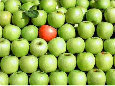
Colour Interaction:

This involves using colours to draw attention to a particular part of an image. Red and yellow are the brightest colours. Colour interaction also involves using contrasting or complimentary colours to draw the viewer into the image.

Colour interaction draws attention to the red apple


Baca selengkapnya

The Design Process

The Design Process
The Design Process

The Design process is a series of steps that a designer takes when working on a project. The details of each stage will differ depending on the type of design but the approach should always be the same. It is vital to stick to the design process during a design as skipping a stage, completing stages out of order or not using the design process at all will result in a lower quality outcome, an outcome the client is not happy with or even worse no outcome at all.

The diagram above outlines the basic stages of the design process and below each stage of the process is explained in more detail.


1. Analyse The Brief

The design process will begin when a client delivers the designer with a brief. The brief will outline what the client wants although as the client will likely have no design experience it is important for the designer to carefully analyse all details given by the client and if necessary to make further enquiries about the needs of the client. It may seem overly simple or just plain obvious but this is a key satge in the design process as if you start out with the wrong idea of what you are being asked to do then you will never be successful. On the other hand, a specific and detailed outline of the clients needs based on the brief will allow for a smooth and successful completion of the design process.


2. Identify The Key Requirements

The next step of the design process is based on the analysis of the brief , now you must identify the most important parts of the brief and what is required to achieve them, whether it is time, software, hardware, samples or something else. Ask yourself, what requirements must I fulfil? For example when designing a poster for an event, the simple act of including the time, date and venue are much more important than any aspect as a poster without the necessary details is useless. It is therefore important to identify and prioritise the key requirements of the brief.

3. Research Existing Design Solutions

Research is important part of the design process in order to identify possible design styles and ideas which may also suit the needs of your client. These samples can be used when meeting with the client to identify the style of image/design which they prefer. For students research will also help to familiarise yourself with industry standard designs and the quality of design which is required.


4. Generate Ideas/Brainstorming

Coming up with an idea for the design, a slogan for a campaign, an image for a poster, a name for a website etc. can be difficult. However, by focussing on fulfilling the key requirements of the brief and allowing your research to inspire you it is possible to generate original designs for your project. Brainstorming is often used where a lack of ideas is a problem. Free writing is a type of brainstorming which simply involves relaxing your mind and writing down any and all ideas you have as quickly as possible without really thinking. Having your research around you can help when doing this. It may seem very simple but generally people have numerous ideas but they tend to dismiss them before writing them down, considering them down and allowing them to be developed into viable design solutions. For help and assistance visit our article on idea generation.


5. Develop Ideas

It is good practice not to settle on simply one idea but rather to choose 2 or 3 of your best ideas and develop them through simple sketches, drawings, colour scheme test pages and font style sheets. These steps all help to develop your ideas and highlight which one has the most potential for success. Sketching will also help to identify possible layouts/compositions that can be used.


6. Produce The Design

Once an idea has been selected and sufficiently developed it is time to begin producing/creating the design. It is important to note that this is commonly the stage of the design process that overeager student designers begin at and without stating the obvious this should never be done. Depending on the type of design different softwares or materials will be used to create the design but regardless of the means of production it is important that the previous stages are not forgotten and that the key requirements are fulfilled.


7. Testing The Design

This is a quick and simple stage of the design process but one that is often overlooked. For printed designs testing simply involves printing the design to ensure the resolution and colours are of good quality, that no clipping of important details occur and that text is readable and without errors. For website design this stage will involve checking that all features are functional, that links are working and that page loading speeds are acceptable.


8. Place the design into the intended environment

For printed designs this will involve placing the poster/logo/sign/banner etc. in its intended position and ensuring that text is readable from an acceptable distant, images are clear and that the colours do not clash with or blend into their surroundings. For websites this will involve publishing the website online and rechecking all features and functions. For other types of designs, such as architecture or interior design, a programme such as Photoshop can be used to digitally place the design into its intended environment.


9. Evaluate The Completed Design

Before printing your final design to the client it is vital that you evaluate it without bias. The easiest way to do this is simply return to stage 2 of the design process where you identified the key requirements of the brief and see if you have successfully fulfilled them. It may also be useful to get the opinion of others at this stage if you fear you will be unable to objectively evaluate your own design.


10. Redesign

This step in the process is only necessary if, after evaluation, you feel you have not successfully met the key requirements of the design brief. This stage involves returning to the beginning of the design process and returning through each step correcting the errors which led to the key requirements not been fulfilled.

If you enjoyed this article then perhaps our articles on the webinterior, games, graphic or furniture design processes may also be of interest.


Baca selengkapnya

A Quick History Of Art & Design

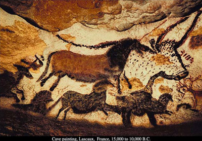
Artists and designers have always been influenced by their environment, so art often reflects its time and place. Design, which is another word for composition, has changed with times and places since the first small sculptures and cave paintings. Of course, in the beginning those who made the first fertility goddesses and paintings of animals were probably not thinking of design in the way that we do now.

Cave Paintings:

It seems from looking at the cave paintings that the painters took advantage of the natural concavities and convexities of the cave walls, to draw their bison and other animal forms. Design also often follows function - so, the cave paintings probably were done a certain way to suit the makers' purposes, whether spiritual or hunting, or both.

A Quick History Of Art & Design
Cave Paintings at Lascaux France

Ancient Egyptians:

One of the first major civilizations to codify design elements was the Egyptian. These wall paintings were done in the service of the Pharaohs, and followed a rigid code of signs, visual rules and meanings to that end.
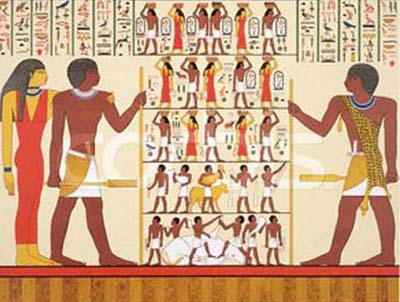


Ancient Egyptian Hieroglyphs were probably not art to the Egyptians, they were functional

There is little shading to indicate three dimensions; the composition is based on a flat pattern, or other two-dimensional design. Images were not drawn from life - but rather from memory or preconceived methods of constructing an image. The purpose is to tell a "story," or promote a political or religious point of view, often, rather than involve purely aesthetic considerations, or, to decorate a functional object, as in crafts. Oriental art also has a tradition of a flat surface, without the use of linear perspective, such as Chinese and Japanese painting, which is based more on non-naturalistic premises, such as contemplation and internal realities, rather than external appearances.


Art made prior to what we consider the beginning of western civilization has usually been called "primitive," meaning that the artists were not artistically trained in a formal sense until perhaps two centuries prior to the birth of Christ. Even now, artists who have not received specialized artistic training are referred to as primitive, or self-taught, like Grandma Moses.
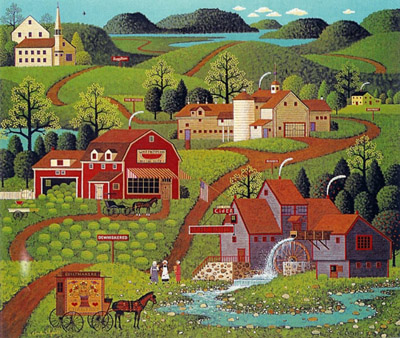


Grandma Moses is a contemporary artist but her style is referred to as primitive

Up until the Greek civilization began, "art" served other purposes than aesthetic, i.e., religious or hunting. Art has served other masters up until our time, also, in the service of the churches from the Middle Ages through the Renaissance; and of various political powers even well into the 20th century. This 'primitive' (an unfortunate term) art possesses certain common characteristics, such as the absence of linear perspective, which results in a flat space, whether in the work of Grandma Moses or in Persian miniatures of the 16th century.


Ancient Greece:
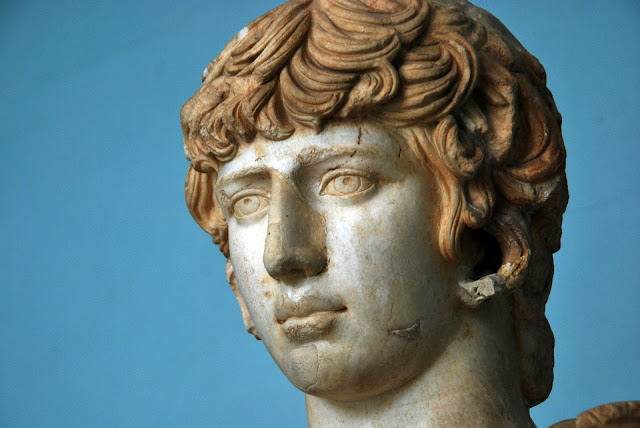
Ancient Greek Sculpture

Returning to the design history timeline we now look at the Greeks. The Greeks were the next major civilization after the Egyptians, who became concerned with anatomical accuracy in their sculpture, as well as the presentation of the ideal. At this time, wall paintings became more concerned with painterly values, and less with ideological constraints, and began to represent three dimensions in figures, though often in a decorative manner.


Decorative is a term which connotes a flat space, and generally is used as a criticism in fine art, when the image is too similar to, say, wallpaper - too concerned with prettiness, too regular, too shallow physically and emotionally, etc., and better suited for interior decorating or craft, where the primary concern is normally harmony, rather than the more substantive demands of fine art.


The Greek aesthetic dealt with order, reason, harmony, and the ideal, and these virtues developed into the forms of their sculpture, which is sheer perfection, based on the forms of nature. Roman art was based on much of Greek art, and continued a similar tradition, with Roman painting more concerned with representations of figures from life - more three-dimensional, more individual, and with more emphasis on modeling in the figures (shading of lights and darks), and the beginning of landscape and still life painting, with more depiction of volume and space.


An idea perhaps originating with the Greeks was the Golden Section. This was an aesthetic and mathematical idea concerning divine proportion, the golden rectangle, and golden proportion. A rectangle was said to be most pleasing to the eye when it possessed a certain ratio of width to height; the mathematical ratio of 0.618:1. Examples of Greek architecture are thought to have contained this 'divine' ratio, as well as their conception of anatomical relationships, for instance, from the top of hair to eyes and from the eyes to the chin of the 'perfect' face. The idea of the golden section continued into the Renaissance, where Italian thinkers expanded the idea.


The Middle Ages:
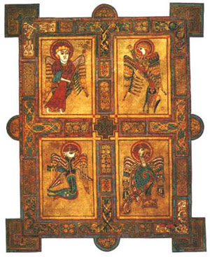
The Book Of Kells - Middle Ages Art


In the Middle Ages, Celtic art contained a combination of abstract and organic elements - with the 'animal' style and interlacing bands, at first symmetrical, and often in metalwork. It then spread to wood, stone and manuscript illumination. After the fall of Rome, Ireland's monasteries produced manuscripts to spread the word of God, which contained this elaborate embellishment, for example in the Book of Kells.


There were strict rules of design - symmetry, connections of lines and images, color repetitions (they eschewed representational images, in preference to ornamental ones), and curvilinear movement. Book covers in Romanesque design were decorative and organic, also in the service of religion or politics. The first real design in art came in Italy at the end of the 13th century, in the painting of Giotto and others. There are hints of three dimensions in the figures, and in space, and in the architectural framework, and the beginnings of perspective.


The Mourning Of Christ by Giotto

There was a new kind of pictorial space - and new pictorial unity, organized rather than casual. There were strong, simple forms, grouping of figures, shallow space, arranged with an inner coherence. Each composition was attuned to the emotional content of the work (the structure conveys meaning, as well as the subject matter). Perspective lines direct our eyes toward a focal point in the distance, and the surface of the painting becomes a window through which we perceive "real" space. There is also more realism, scenes of daily life, and a more secular approach. In around 1400, deep atmospheric space appeared in painting, although not in a formal sense.


The Renaissance:

In the Renaissance, the emphasis was humanistic, rather than divine - man, not God. The Flemish in the North had an interest in realism (imitation of nature), and the symbolism of everyday objects (the physical world is a mirror of divine truths). This was also the beginning of the use of oil paint, so there was a more subtle colour range than in previous mediums.
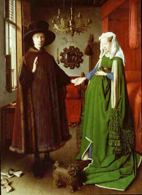

The Arnolfini wedding is a famous Renaissance artwork

Atmospheric perspective appeared - this means that there is less contrast and saturation of the colors in the space furthest away from the painting surface (depth), which also gives the work a certain unity. The artist in Italy was no longer perceived as merely a craftsman. Linear perspective was invented at this time, also - lines receding in space toward a vanishing point on the horizon line, at the viewer's eye level.


Science came to the aid of artists, as more importance was placed on objective accuracy of images. There was an interest in the nude figure, and its anatomical accuracy; using chiaroscuro (light and dark shading) to indicate volume in forms, and as a unifying element in the composition (eliminating the barriers of contour lines between forms). Color harmonies began to be studied, and artists began doing preliminary studies for composing artworks. They also began to use geometric forms to compose and stabilize compositions, such as the triangle.
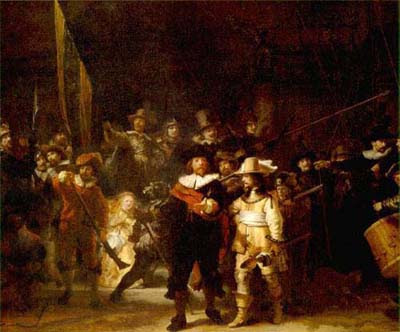

Night Watch by Rembrandt is a famous Renaissance artwork

The painter Titian began to leave individual brushstrokes visible on the painting surface, in an unfinished manner, allowing marks to become compositional elements. In the Mannerist style, art became more emotional, as a reaction against the precision of the Renaissance, with exaggerated forms and perspective, as with El Greco.


Baroque painting brought the beginning of gestural composition, where there is a sweeping compositional motion in the work, curvilinear in aspect. Rembrandt and others began to do studies of color and light for paintings in this manner, rather than drawing the forms and filling them in. This causes a "painterly" style, as opposed to a linear style, which means that there is inter-movement and interconnection of the forms, by means of shared color and tone, and easier movement between forms in the composition, with shape, rather than line. This brought a unified vision to the painting. Rembrandt also used other paintings for compositional ideas. As Rembrandt did with dark tones, Vermeer did with light, as well as rhythms and proportions, creating an overall unity in his paintings.


Impressionism:
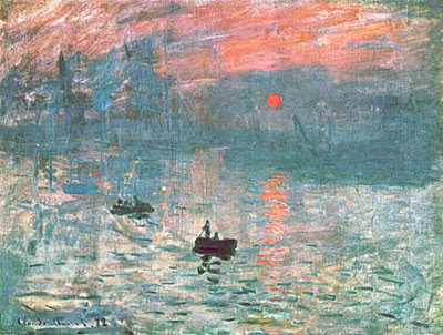

Paintings like this by Manet were typical of the impressionist style

These influences caused Manet to paint with little modeling and blending of the brushstrokes - the painting is no longer a window onto the world, but a flat surface which has its own reality of pure painting - brushstrokes, color, composition, etc. He then also influenced the young Impressionists Monet and Renoir, and others, to paint not grand history or classical works in the studio, but to work from life, in the plain air, with separate touches of color left as such, and not blended smoothly, and to paint modern life, not centuries ago.


They also were interested in current theories of color, how colors reacted to one another on the canvas; and were influenced by the new invention of the camera, with its casual images where the forms were often cut off at the edge of the painting (look at many of Degas' works), and also by the influx of Japanese prints, with their flatness and lack of depth.


Rodin, in sculpture, also leaves parts of his forms "unfinished," and this unfinished quality becomes an expressive statement and aesthetic principle, fragmentary and poetic, leaving the viewer to finish the image in his or her mind.
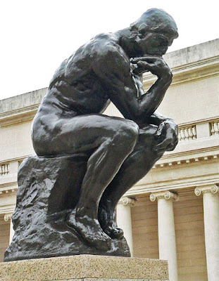
The Thinker by Rodin

Post-Impressionism:

Then, along came Cezanne. He came under Pissarro's tutelage and painted from life with the Impressionists, then gradually went his own way. He merged the 'formlessness' of Impressionism with the geometric structuring of the classical painters, creating a new kind of space, which is a combination of Renaissance space with its linear perspective and the illusion of distance, with the modern, flat space. This combining of the two kinds of space causes a great tension and power in his work, which is also released due to the great harmony his works also contain; and also is the cause of his distortions of objects and perspective.
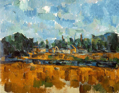
Paintings like this by Cezanne were typical of the post impressionist style

Another Post-Impressionist, Seurat, used small, precise dots of color and vertical and horizontal design elements, arranged according to mathematical principles and scientific color theories. Van Gogh expanded the dot to the personal handwriting of the 'mark,' and used color in an emotional, as well as visual, way. Gauguin painted in a flat, pre-Renaissance manner, with colors independent of their identity in 'real' life, in a Symbolist manner.


The painter Maurice Denis declared that painting is not about the subject, but rather is a flat surface that is covered with colors in a particular order (about the last decade of the 19th century). Here, the inner vision of the artist is more important than the "correct" observation of nature, in a more 'innocent' expression than that of 'civilized' man. The 20th century, with its myriad of ism's and new ideas, arrived, from Matisse, with his fauvist riotous color and sweeping, free compositional movement to an expressive end; to Picasso, with his continuation of Cezanne's ideas into the pictorial structure of cubism. In 1910, abstraction made its first appearance, in the work of Kandinsky, among others. Abstraction is considered to be modified shapes of visible reality; whereas non-objective means that there is no resemblance to physical reality, nor is there a possibly literary reference anywhere in the work - it is its own reality. Mondrian took the use of geometric design to the limit, where previously design was based as much on nature.
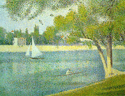


The Seine and la Grande Jatte by Seurat

Early 20th Century:

Early 20th century serious formal experimentation and study of design principles was done by such groups as the Constructivists, de Stijl, Suprematists, the Bauhaus, and a number of others, including Moholy-Nagy, who wrote a book on design, Vision in Motion, and Josef Albers, who spent a lifetime studying the interaction of colors. The collage was invented, in which newspapers and other actual objects, such as chair caning, were pasted onto the canvas. There is no more illusionistic space, modeling, foreshortening - only overlapping of real objects on the surface - creating a new, completely flat space.
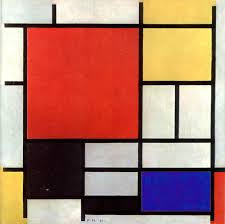
Painting in the De Stijl style

Futurism introduced the idea of physical movement into painting, and thus, the element of time, and the idea of the machine; with its modern connotations (Einstein's and Freud's ideas had just arrived). The subject of the work of art becomes the visual elements it contains, and their formal arrangement. Fantasy also becomes an element, in the work of Chagall, Klee and de Chirico. And the Dadaists arrived, with Duchamp and others (Duchamp can be considered the first 'conceptual' artist - where the idea of the work of art is more significant than the actual art object.)


Dada was a form of protest of the First World War, and its resultant disillusionment. All aesthetic and moral values were rendered meaningless; so the Dadaists set out to turn sacred artistic values on their ears. They created 'anti-art,' which was based on the unconscious and the laws of chance. In the 1917 Society of Independent Artists exhibition in New York, Duchamp exhibited a "readymade" or 'found' object - a urinal - under the pseudonym of "R Mutt." He and others were questioning the very nature of art - what is art? What is not art? Is it art because the artist says it is, or does it become art when it is placed in a museum? Suddenly the "rules" were thrown out the window for the Dadaist anarchy. During the 20th century, the notion of an "artless" art came into fashion - innocent, bold, free, free of rules and preconceptions - not unlike what children produce naturally, as perhaps being more "genuine," or honest.
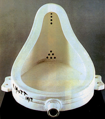

Le Fontaine by Marcel Duschamp

Surrealism:

Surrealist Painting by Salvador Dali

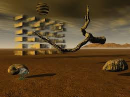
Surrealism was based on the ideas put forth by Dada, and continued these ideas further in the 1920's and 1930's, basing the work not on reason or moral purpose, but according to the laws of chance, dreams, and the unconscious. The most famous Surrealist was Salvador Dali, who painted 'unreality' in a most realistic manner. There were also artists loosely connected with Surrealism, whose work does not physically resemble that of Dali, such as Joan Miro, whose work is biomorphic in nature, and who did not consider himself to be an abstractionist, though his work is so removed from its sources that it appears to be so.


Surrealism also influenced the Abstract Expressionists in the 1940's in America. Figures such as Max Ernst and Arshile Gorky influenced many American and European exiled painters before and after World War II, with their conceptual and gestural ideas about painting. Gestural composition is composition based not on geometric forms, but rather on a generally organic "gesture" or sweeping motion across the canvas, generally abstract or partially abstract in nature.

Abstract Expressionism:

The abstract expressionists, or action painters, such as Jackson Pollock and Willem de Kooning, are examples of this style of painting, which became the dominant force in art in the 1950's in America and around the world. Painting was thought to be based on a more spiritual source, and the painters in this school all did work which was dissimilar, and widely ranging, from the geometric abstraction of Barnett Newman to the poetic color field painting of Mark Rothko.
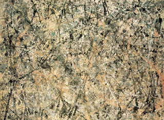


Painting by Jackson Pollock

Pollock himself invented a new way of working, historically important in method and concept. He used the brush in a new way - dripping and pouring paint in swirls and drips around the canvas, which he placed on the floor. The resultant space of this multi-layered imaging was unlike any space seen so far; it reminds me of outer space - infinite space, which we see as a limitless but flat surface. This type of composition came to be called "all-over" - which means that every part of the canvas is equal to every other, and all are on the same plane in space. This is in contrast to traditional composition, which dictated that there be a focal point in the painting, one area that was the more important.


Pop Art:

The process of monoprinting brings out the significance of the accidental. Much of this and more contemporary art reminds me of a manmade nature - with industrial origins - like rust, accidental stains, cracking and peeling paint, plaster and stone, etc. Images which are made in printmaking processes by the use of various tools begin to show up in painting as well.


How the image gets to the canvas doesn't matter - brush, finger, spill, stencil - the image itself is what matters. In this context, Rauschenberg and Jasper Johns' methods of collaging images becomes more pertinent to contemporary life, with its patchwork rhythms. There is geometry, but the work is also romantic/playful, and there are the modern notions of accident and lyricism. There is now a blending of romantic and classical, not like the opposition of these two forces in 19th century French painting.
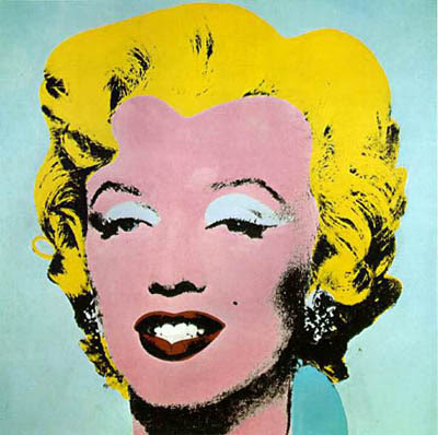
Marylin Monroe Monoprint by Andy Warhol

In Pop art, the raw material of art is the new consumer environment - advertising, mass-production, billboards, and comic books. And the forms and compositions are also borrowed from these sources: Lichtenstein's dot comic book paintings; Warhol's repeated soup cans; Rosenquist's billboard-influenced paintings; Jasper Johns' bronze beer cans.

Conceptualism:
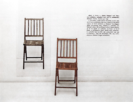
One and Three Chairs by Joseph Kosuth
Conceptualism, also begun in the 1960's (Duchamp can, however, be considered its first proponent, in the beginning of the 20th century) is concerned with the idea of a work of art being more important than the execution of the work, i.e., idea over product. This movement has produced an infinite number of variations of this idea - each artist and each work of art presents a new visual form and idea, rather than a stylistic similarity. Sometimes there is no visual product involved - perhaps only photographs taken of the art as it was enacted. To a lesser extent, this also contains the idea that art in our contemporary world has become a "commodity" like any other - to be bought, traded, and measured in financial value. If the artwork is only an idea without physical form, it defies commodification. In this sense, there is no "design," or "composition," or sometimes even any visual component to conceptualist art.

Environmental Art:

Finally, there is environmental, or earth art, also begun in the late '60's. Christo and Jeanne-Claude, and Robert Smithson are perhaps its best known artists. Art is made out of natural elements, often very large, like bodies of water and islands, of natural and man made materials. Christo and Jeanne-Claude also sometimes "wrap" buildings and islands, or construct a trail of large umbrellas, or very high and lengthy fabric curtains in a landscape, for temporary artworks.


A wrapped building by Christo

It is a very interesting process, for they begin by contacting and dealing with the inhabitants of that landscape, usually resulting in public hearings where the pros and cons of the proposed artwork are discussed, sometimes hotly. Christo and Jeanne-Claude have a team of workers who construct these projects; and often, after they have presented their proposal and vision to the inhabitants, they also become enthusiastic, after their initial reluctance. This desire for interaction with the public is an attempt of artists to include society in the art-making process itself - a collaboration, which is also a characteristic of much conceptual art. 

Conclusion:

Contemporary society has marginalized the artist; painting and sculpture have taken a backseat to the main art form, film. I think artists have responded to this by trying to upgrade their act into an interactive, up-to-the-minute offering - perhaps to survive. Modernism, considered to be from around 1905 to the 1950's, was concerned with explorations of design and formal elements in painting, such as composition, space, and color.
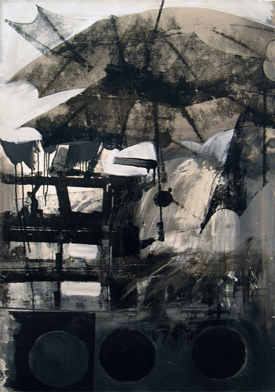


A contemporary artwork by Robert Rauschenberg


This caused many new forms and structures in art, "pushing the envelope" of formal invention, and often was characterized by a stringent adherence to concepts and formal design experimentation, with a concurrent sober and heroic stance. With the advent of Pop art, this aristocratic attitude lightened up somewhat, ushering in the Post-Modern era, with its connotations of relaxed formal concerns. In college design courses, sometimes the curriculum is a rigorous and systematic study of design principles, with many projects to carry out these principles.


The truth is though nowadays anything in any style can be art. I will leave with you with this quote, attributed to Marcel Duschamp.


I am an artist, therefore anything I make or do is art.


Baca selengkapnya