Kamis, 26 November 2015

A Quick History Of Art & Design

Artists and designers have always been influenced by their environment, so art often reflects its time and place. Design, which is another word for composition, has changed with times and places since the first small sculptures and cave paintings. Of course, in the beginning those who made the first fertility goddesses and paintings of animals were probably not thinking of design in the way that we do now.

Cave Paintings:

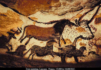
It seems from looking at the cave paintings that the painters took advantage of the natural concavities and convexities of the cave walls, to draw their bison and other animal forms. Design also often follows function - so, the cave paintings probably were done a certain way to suit the makers' purposes, whether spiritual or hunting, or both.

A Quick History Of Art & Design
Cave Paintings at Lascaux France

Ancient Egyptians:

One of the first major civilizations to codify design elements was the Egyptian. These wall paintings were done in the service of the Pharaohs, and followed a rigid code of signs, visual rules and meanings to that end.
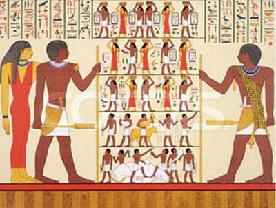


Ancient Egyptian Hieroglyphs were probably not art to the Egyptians, they were functional

There is little shading to indicate three dimensions; the composition is based on a flat pattern, or other two-dimensional design. Images were not drawn from life - but rather from memory or preconceived methods of constructing an image. The purpose is to tell a "story," or promote a political or religious point of view, often, rather than involve purely aesthetic considerations, or, to decorate a functional object, as in crafts. Oriental art also has a tradition of a flat surface, without the use of linear perspective, such as Chinese and Japanese painting, which is based more on non-naturalistic premises, such as contemplation and internal realities, rather than external appearances.


Art made prior to what we consider the beginning of western civilization has usually been called "primitive," meaning that the artists were not artistically trained in a formal sense until perhaps two centuries prior to the birth of Christ. Even now, artists who have not received specialized artistic training are referred to as primitive, or self-taught, like Grandma Moses.
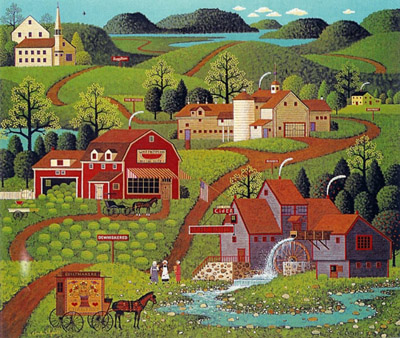


Grandma Moses is a contemporary artist but her style is referred to as primitive

Up until the Greek civilization began, "art" served other purposes than aesthetic, i.e., religious or hunting. Art has served other masters up until our time, also, in the service of the churches from the Middle Ages through the Renaissance; and of various political powers even well into the 20th century. This 'primitive' (an unfortunate term) art possesses certain common characteristics, such as the absence of linear perspective, which results in a flat space, whether in the work of Grandma Moses or in Persian miniatures of the 16th century.


Ancient Greece:
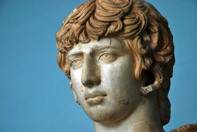
Ancient Greek Sculpture

Returning to the design history timeline we now look at the Greeks. The Greeks were the next major civilization after the Egyptians, who became concerned with anatomical accuracy in their sculpture, as well as the presentation of the ideal. At this time, wall paintings became more concerned with painterly values, and less with ideological constraints, and began to represent three dimensions in figures, though often in a decorative manner.


Decorative is a term which connotes a flat space, and generally is used as a criticism in fine art, when the image is too similar to, say, wallpaper - too concerned with prettiness, too regular, too shallow physically and emotionally, etc., and better suited for interior decorating or craft, where the primary concern is normally harmony, rather than the more substantive demands of fine art.


The Greek aesthetic dealt with order, reason, harmony, and the ideal, and these virtues developed into the forms of their sculpture, which is sheer perfection, based on the forms of nature. Roman art was based on much of Greek art, and continued a similar tradition, with Roman painting more concerned with representations of figures from life - more three-dimensional, more individual, and with more emphasis on modeling in the figures (shading of lights and darks), and the beginning of landscape and still life painting, with more depiction of volume and space.


An idea perhaps originating with the Greeks was the Golden Section. This was an aesthetic and mathematical idea concerning divine proportion, the golden rectangle, and golden proportion. A rectangle was said to be most pleasing to the eye when it possessed a certain ratio of width to height; the mathematical ratio of 0.618:1. Examples of Greek architecture are thought to have contained this 'divine' ratio, as well as their conception of anatomical relationships, for instance, from the top of hair to eyes and from the eyes to the chin of the 'perfect' face. The idea of the golden section continued into the Renaissance, where Italian thinkers expanded the idea.


The Middle Ages:
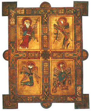
The Book Of Kells - Middle Ages Art


In the Middle Ages, Celtic art contained a combination of abstract and organic elements - with the 'animal' style and interlacing bands, at first symmetrical, and often in metalwork. It then spread to wood, stone and manuscript illumination. After the fall of Rome, Ireland's monasteries produced manuscripts to spread the word of God, which contained this elaborate embellishment, for example in the Book of Kells.


There were strict rules of design - symmetry, connections of lines and images, color repetitions (they eschewed representational images, in preference to ornamental ones), and curvilinear movement. Book covers in Romanesque design were decorative and organic, also in the service of religion or politics. The first real design in art came in Italy at the end of the 13th century, in the painting of Giotto and others. There are hints of three dimensions in the figures, and in space, and in the architectural framework, and the beginnings of perspective.


The Mourning Of Christ by Giotto

There was a new kind of pictorial space - and new pictorial unity, organized rather than casual. There were strong, simple forms, grouping of figures, shallow space, arranged with an inner coherence. Each composition was attuned to the emotional content of the work (the structure conveys meaning, as well as the subject matter). Perspective lines direct our eyes toward a focal point in the distance, and the surface of the painting becomes a window through which we perceive "real" space. There is also more realism, scenes of daily life, and a more secular approach. In around 1400, deep atmospheric space appeared in painting, although not in a formal sense.


The Renaissance:

In the Renaissance, the emphasis was humanistic, rather than divine - man, not God. The Flemish in the North had an interest in realism (imitation of nature), and the symbolism of everyday objects (the physical world is a mirror of divine truths). This was also the beginning of the use of oil paint, so there was a more subtle colour range than in previous mediums.
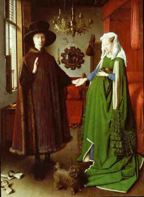

The Arnolfini wedding is a famous Renaissance artwork

Atmospheric perspective appeared - this means that there is less contrast and saturation of the colors in the space furthest away from the painting surface (depth), which also gives the work a certain unity. The artist in Italy was no longer perceived as merely a craftsman. Linear perspective was invented at this time, also - lines receding in space toward a vanishing point on the horizon line, at the viewer's eye level.


Science came to the aid of artists, as more importance was placed on objective accuracy of images. There was an interest in the nude figure, and its anatomical accuracy; using chiaroscuro (light and dark shading) to indicate volume in forms, and as a unifying element in the composition (eliminating the barriers of contour lines between forms). Color harmonies began to be studied, and artists began doing preliminary studies for composing artworks. They also began to use geometric forms to compose and stabilize compositions, such as the triangle.
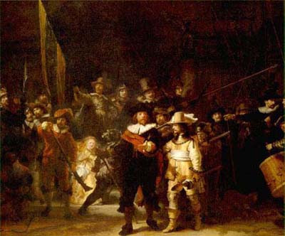

Night Watch by Rembrandt is a famous Renaissance artwork

The painter Titian began to leave individual brushstrokes visible on the painting surface, in an unfinished manner, allowing marks to become compositional elements. In the Mannerist style, art became more emotional, as a reaction against the precision of the Renaissance, with exaggerated forms and perspective, as with El Greco.


Baroque painting brought the beginning of gestural composition, where there is a sweeping compositional motion in the work, curvilinear in aspect. Rembrandt and others began to do studies of color and light for paintings in this manner, rather than drawing the forms and filling them in. This causes a "painterly" style, as opposed to a linear style, which means that there is inter-movement and interconnection of the forms, by means of shared color and tone, and easier movement between forms in the composition, with shape, rather than line. This brought a unified vision to the painting. Rembrandt also used other paintings for compositional ideas. As Rembrandt did with dark tones, Vermeer did with light, as well as rhythms and proportions, creating an overall unity in his paintings.


Impressionism:
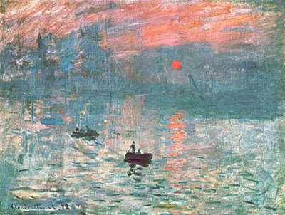

Paintings like this by Manet were typical of the impressionist style

These influences caused Manet to paint with little modeling and blending of the brushstrokes - the painting is no longer a window onto the world, but a flat surface which has its own reality of pure painting - brushstrokes, color, composition, etc. He then also influenced the young Impressionists Monet and Renoir, and others, to paint not grand history or classical works in the studio, but to work from life, in the plain air, with separate touches of color left as such, and not blended smoothly, and to paint modern life, not centuries ago.


They also were interested in current theories of color, how colors reacted to one another on the canvas; and were influenced by the new invention of the camera, with its casual images where the forms were often cut off at the edge of the painting (look at many of Degas' works), and also by the influx of Japanese prints, with their flatness and lack of depth.


Rodin, in sculpture, also leaves parts of his forms "unfinished," and this unfinished quality becomes an expressive statement and aesthetic principle, fragmentary and poetic, leaving the viewer to finish the image in his or her mind.
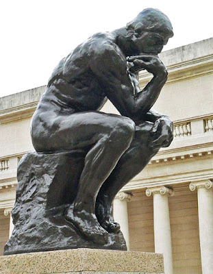
The Thinker by Rodin

Post-Impressionism:

Then, along came Cezanne. He came under Pissarro's tutelage and painted from life with the Impressionists, then gradually went his own way. He merged the 'formlessness' of Impressionism with the geometric structuring of the classical painters, creating a new kind of space, which is a combination of Renaissance space with its linear perspective and the illusion of distance, with the modern, flat space. This combining of the two kinds of space causes a great tension and power in his work, which is also released due to the great harmony his works also contain; and also is the cause of his distortions of objects and perspective.
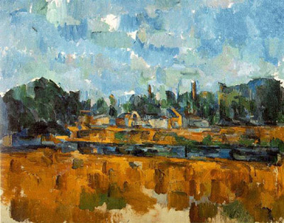
Paintings like this by Cezanne were typical of the post impressionist style

Another Post-Impressionist, Seurat, used small, precise dots of color and vertical and horizontal design elements, arranged according to mathematical principles and scientific color theories. Van Gogh expanded the dot to the personal handwriting of the 'mark,' and used color in an emotional, as well as visual, way. Gauguin painted in a flat, pre-Renaissance manner, with colors independent of their identity in 'real' life, in a Symbolist manner.


The painter Maurice Denis declared that painting is not about the subject, but rather is a flat surface that is covered with colors in a particular order (about the last decade of the 19th century). Here, the inner vision of the artist is more important than the "correct" observation of nature, in a more 'innocent' expression than that of 'civilized' man. The 20th century, with its myriad of ism's and new ideas, arrived, from Matisse, with his fauvist riotous color and sweeping, free compositional movement to an expressive end; to Picasso, with his continuation of Cezanne's ideas into the pictorial structure of cubism. In 1910, abstraction made its first appearance, in the work of Kandinsky, among others. Abstraction is considered to be modified shapes of visible reality; whereas non-objective means that there is no resemblance to physical reality, nor is there a possibly literary reference anywhere in the work - it is its own reality. Mondrian took the use of geometric design to the limit, where previously design was based as much on nature.
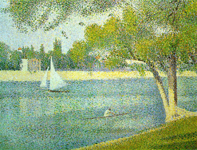


The Seine and la Grande Jatte by Seurat

Early 20th Century:

Early 20th century serious formal experimentation and study of design principles was done by such groups as the Constructivists, de Stijl, Suprematists, the Bauhaus, and a number of others, including Moholy-Nagy, who wrote a book on design, Vision in Motion, and Josef Albers, who spent a lifetime studying the interaction of colors. The collage was invented, in which newspapers and other actual objects, such as chair caning, were pasted onto the canvas. There is no more illusionistic space, modeling, foreshortening - only overlapping of real objects on the surface - creating a new, completely flat space.
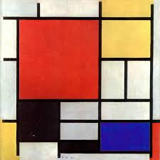
Painting in the De Stijl style

Futurism introduced the idea of physical movement into painting, and thus, the element of time, and the idea of the machine; with its modern connotations (Einstein's and Freud's ideas had just arrived). The subject of the work of art becomes the visual elements it contains, and their formal arrangement. Fantasy also becomes an element, in the work of Chagall, Klee and de Chirico. And the Dadaists arrived, with Duchamp and others (Duchamp can be considered the first 'conceptual' artist - where the idea of the work of art is more significant than the actual art object.)


Dada was a form of protest of the First World War, and its resultant disillusionment. All aesthetic and moral values were rendered meaningless; so the Dadaists set out to turn sacred artistic values on their ears. They created 'anti-art,' which was based on the unconscious and the laws of chance. In the 1917 Society of Independent Artists exhibition in New York, Duchamp exhibited a "readymade" or 'found' object - a urinal - under the pseudonym of "R Mutt." He and others were questioning the very nature of art - what is art? What is not art? Is it art because the artist says it is, or does it become art when it is placed in a museum? Suddenly the "rules" were thrown out the window for the Dadaist anarchy. During the 20th century, the notion of an "artless" art came into fashion - innocent, bold, free, free of rules and preconceptions - not unlike what children produce naturally, as perhaps being more "genuine," or honest.
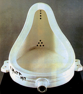

Le Fontaine by Marcel Duschamp

Surrealism:

Surrealist Painting by Salvador Dali

Surrealism was based on the ideas put forth by Dada, and continued these ideas further in the 1920's and 1930's, basing the work not on reason or moral purpose, but according to the laws of chance, dreams, and the unconscious. The most famous Surrealist was Salvador Dali, who painted 'unreality' in a most realistic manner. There were also artists loosely connected with Surrealism, whose work does not physically resemble that of Dali, such as Joan Miro, whose work is biomorphic in nature, and who did not consider himself to be an abstractionist, though his work is so removed from its sources that it appears to be so.


Surrealism also influenced the Abstract Expressionists in the 1940's in America. Figures such as Max Ernst and Arshile Gorky influenced many American and European exiled painters before and after World War II, with their conceptual and gestural ideas about painting. Gestural composition is composition based not on geometric forms, but rather on a generally organic "gesture" or sweeping motion across the canvas, generally abstract or partially abstract in nature.

Abstract Expressionism:

The abstract expressionists, or action painters, such as Jackson Pollock and Willem de Kooning, are examples of this style of painting, which became the dominant force in art in the 1950's in America and around the world. Painting was thought to be based on a more spiritual source, and the painters in this school all did work which was dissimilar, and widely ranging, from the geometric abstraction of Barnett Newman to the poetic color field painting of Mark Rothko.
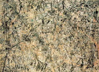


Painting by Jackson Pollock

Pollock himself invented a new way of working, historically important in method and concept. He used the brush in a new way - dripping and pouring paint in swirls and drips around the canvas, which he placed on the floor. The resultant space of this multi-layered imaging was unlike any space seen so far; it reminds me of outer space - infinite space, which we see as a limitless but flat surface. This type of composition came to be called "all-over" - which means that every part of the canvas is equal to every other, and all are on the same plane in space. This is in contrast to traditional composition, which dictated that there be a focal point in the painting, one area that was the more important.


Pop Art:

The process of monoprinting brings out the significance of the accidental. Much of this and more contemporary art reminds me of a manmade nature - with industrial origins - like rust, accidental stains, cracking and peeling paint, plaster and stone, etc. Images which are made in printmaking processes by the use of various tools begin to show up in painting as well.


How the image gets to the canvas doesn't matter - brush, finger, spill, stencil - the image itself is what matters. In this context, Rauschenberg and Jasper Johns' methods of collaging images becomes more pertinent to contemporary life, with its patchwork rhythms. There is geometry, but the work is also romantic/playful, and there are the modern notions of accident and lyricism. There is now a blending of romantic and classical, not like the opposition of these two forces in 19th century French painting.
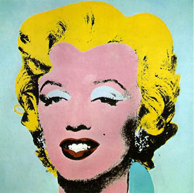
Marylin Monroe Monoprint by Andy Warhol

In Pop art, the raw material of art is the new consumer environment - advertising, mass-production, billboards, and comic books. And the forms and compositions are also borrowed from these sources: Lichtenstein's dot comic book paintings; Warhol's repeated soup cans; Rosenquist's billboard-influenced paintings; Jasper Johns' bronze beer cans.

Conceptualism:
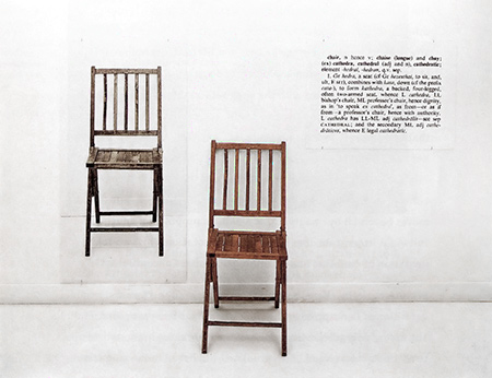
One and Three Chairs by Joseph Kosuth
Conceptualism, also begun in the 1960's (Duchamp can, however, be considered its first proponent, in the beginning of the 20th century) is concerned with the idea of a work of art being more important than the execution of the work, i.e., idea over product. This movement has produced an infinite number of variations of this idea - each artist and each work of art presents a new visual form and idea, rather than a stylistic similarity. Sometimes there is no visual product involved - perhaps only photographs taken of the art as it was enacted. To a lesser extent, this also contains the idea that art in our contemporary world has become a "commodity" like any other - to be bought, traded, and measured in financial value. If the artwork is only an idea without physical form, it defies commodification. In this sense, there is no "design," or "composition," or sometimes even any visual component to conceptualist art.

Environmental Art:

Finally, there is environmental, or earth art, also begun in the late '60's. Christo and Jeanne-Claude, and Robert Smithson are perhaps its best known artists. Art is made out of natural elements, often very large, like bodies of water and islands, of natural and man made materials. Christo and Jeanne-Claude also sometimes "wrap" buildings and islands, or construct a trail of large umbrellas, or very high and lengthy fabric curtains in a landscape, for temporary artworks.


A wrapped building by Christo

It is a very interesting process, for they begin by contacting and dealing with the inhabitants of that landscape, usually resulting in public hearings where the pros and cons of the proposed artwork are discussed, sometimes hotly. Christo and Jeanne-Claude have a team of workers who construct these projects; and often, after they have presented their proposal and vision to the inhabitants, they also become enthusiastic, after their initial reluctance. This desire for interaction with the public is an attempt of artists to include society in the art-making process itself - a collaboration, which is also a characteristic of much conceptual art. 

Conclusion:

Contemporary society has marginalized the artist; painting and sculpture have taken a backseat to the main art form, film. I think artists have responded to this by trying to upgrade their act into an interactive, up-to-the-minute offering - perhaps to survive. Modernism, considered to be from around 1905 to the 1950's, was concerned with explorations of design and formal elements in painting, such as composition, space, and color.
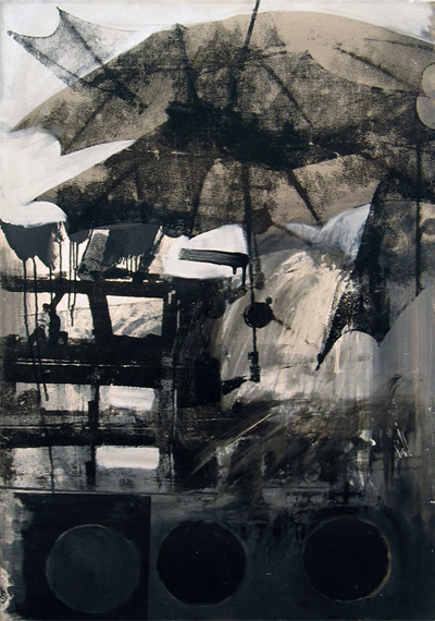


A contemporary artwork by Robert Rauschenberg


This caused many new forms and structures in art, "pushing the envelope" of formal invention, and often was characterized by a stringent adherence to concepts and formal design experimentation, with a concurrent sober and heroic stance. With the advent of Pop art, this aristocratic attitude lightened up somewhat, ushering in the Post-Modern era, with its connotations of relaxed formal concerns. In college design courses, sometimes the curriculum is a rigorous and systematic study of design principles, with many projects to carry out these principles.


The truth is though nowadays anything in any style can be art. I will leave with you with this quote, attributed to Marcel Duschamp.


I am an artist, therefore anything I make or do is art.


Baca selengkapnya

Colour Theory

Meaning of Colours
If you understand the theory of colours you are better placed to choose the right colour for the right job
When presenting a design or an idea your choice of colours is very important. Many surveys have been carried out on the general public to find out what people like. The findings suggest that very young children like bright, vibrant colours (reds, yellows and oranges etc...) whilst older people like more gentle or sophisticated colours and tones such as shades of blue. It is very important for a designer to understand the way colours are put together/created as this may help in the selection of the right colour scheme for a particular age group. Next time you pass a poster look closely at the colours - the designer has considered them very carefully.

What is Colour?

Colour is how the eye perceives reflected light. What I will explain here are the three main components of a colour: hue, value and saturation.
colour properties
  • Hue is where a colour is positioned on the colour wheel. Technically the hue is the colour which it a design element in itself.
  • Value is the darkness or lightness of a colour and is a design element in itself.
  • Saturation is the intensity of a colour.

The Colour Wheel


The Colour Wheel
The Colour Wheel
The colour wheel can be seen above and this can be used to help remember primary and secondary colours. The secondary colours are in between the primary colours - for example - between red and blue is purple. Quite simply, mixing the primary colours of red and blue paint together will produce the secondary colour purple.

An important rule of the colour wheel is that colours opposite to each other on the colour wheel usually work well together as a colour scheme. These are known as complimentary colours. Complimentary colours are often used together in graphic design as they tend to give the image/graphic a sense of balance and are visually more aesthetic.

Primary Colours

These are colours that cannot be created through the mixing of other colours. They are colours in their own right. The three primary colours are REDYELLOW and  BLUE. Primary colours can be mixed together to produce secondary colours.

Secondary Colours

The secondary colours are in between the primary colours on the colour wheel to depict the mixing of the primary colours on either side to create the secondary colour between. The formulae below show the combinations required to produce secondary colours.

YELLOW + BLUE = GREEN

BLUE + RED = PURPLE

RED + YELLOW = ORANGE

Complimentary Colours

As already mentioned, the complimentary colours are those opposite to each other on the colour wheel and which, when used together in a design, are more visually aesthetic or "pleasing to the eye". The complimentary colours are...

RED and GREEN
YELLOW and PURPLE
BLUE  and ORANGE

Meaning of Colours

Designers have a large range of colours at their disposal and most are well aware that certain colours are associated with feelings and emotions. The diagram below show a number of popular colours and the feelings/emotions to which they are associated. Designers, companies and manufacturers use colours cleverly to promote a certain feeling about their products.

Meaning of Colours
meaning of colours

Colours in Context

Colours also have an effect on your visitors before they begin to read the content of your web site or printed design. Thus, it is very important for you to consider your target audience, the psychology of colour, and the corporate image you wish to project BEFORE you complete your design.

Colour can have different meanings in different scenarios

Using Colour

When colour is used correctly, it can add impact and clarity to your message and highlight important points. Alternatively When colour is used incorrectly, it can compromise your message and confuse your target audience.

Colour can work for your web site and printed materials in various ways:
  • Colour emphasizes, highlights, and leads the eye to important points or links.
  • Colour identifies recurring themes (i.e. titles and subtitles are usually the same colours).
  • Conversely, colour can differentiate, such as different colours in pie charts and bar graphs.
  • Colour symbolizes and triggers emotions and associations.

The interpretation of a colour depends on culture, profession, and personal preference. In general, the colours red, orange, and yellow are "exciting" colours and the colors purple, blue, and green are "calming" colours.

Interpretation of colour is not always a matter of personal preference. For example, in Western cultures the colour white symbolizes purity; however, in China the colour white symbolizes death.

To summarise, it is very important to consider your target audience, the psychology of colour, and the image you wish to project before you construct your web-site, printed materials, and logo.

For information on creating your own colour scheme for a design project see the colour schemes section.


Baca selengkapnya

Senin, 23 November 2015

Design Presentation Tips


Presentation Board
Sample Presentation Board

When presenting a single design or an entire design portfolio there are certain tips and techniques that you should consider. If you are creating a presentation board for an interior design project, visit our extended article specifically dedicated to Interior Design Presentation boards. When presenting a design concept board information contained within the presentation drawings can be supplemented by accompanying text. This text is another important element in the design of a graphic presentation. The display of text needs to be considered, it might be boxed out or weaved into the actual drawings. In terms of the general layout of a presentation board consider these tips.

General Presentation Tips:

  • A good presentation should not be cluttered, it needs to have sufficient space to allow the information to be easily read and absorbed.
  • The information may be rendered in varying sizes or using different graphic styles and techniques.
  • The content should align purposefully as this will help the viewer read the individual elements as a collective set.
  • The graphic presentation style you choose should complement the design idea being conveyed and of course the presentation should clearly communicate the designers idea, concept and intention.
  • Overall keep it clear and simple.
  •  Remember that any text is supplementary; the drawings should remain the primary means of communication and the focal point of the presentation.

When planning a design presentation portfolio needs careful consideration and organisation, but using a storyboard framework can help you organise the content of your portfolio of work. Before you begin follow these steps...

Portfolio Presentation Tips:

  • Determine the audience for your presentation. What will they want to see?
  • Write an outline or brief for your presentation
  • Draw up a sequenced list of content for you presentation
  • Consider the best format and layout of the sheet(s)
  • Choose a font style and size that will compliment your images. Remember you will need to use the font consistently throughout
  • Consider the distinct, separate sections of your presentation
  • For concept boards, denote the creative journey of your presentation. Indicate in words and sketches the sequence of the project and the specific images associated with it
  • For multiple page projects, label each page according to the sequenced list of contents you compiled earlier.
  • Consider how the content connects to one another. Edit and revise where necessary until you are happy with the narrative
  • Once happy with everything, assemble your portfolio so it corresponds with the flatplan.


Baca selengkapnya

Rabu, 11 November 2015

Top 5 Interior Design Tips

1. Start With Something Special


Top 5 Interior Design Tips
This room could have started with the blue lamp....

Start a project by picking just one item that you really like. That could be a anything from a fabric pattern , a piece of furniture, a cushion to a piece of art. The item doesn't need to be a feature piece it just gets you started.

Then let that item set the theme and style for the room and you'll find that the rest of your decisions will follow on from that. Easy!


2. Feature Something, But Not Everything

The artwork is left alone on the wall so it can be a feature, other art would only detract and distract from it

Don't try and make everything a feature. Let the real feature stand out, give it room to breath and be appreciated. 


Keep an open mind on what can be a feature. It could be anything from a fireplace to a painting or maybe an old fashioned chandelier.

3. Keep It Consistent

This room is consistent in terms of style and colour palette


Aim to maintain the one style throughout the room and preferably throughout the house, whether your chosen style is traditional, modern, contemporary or of a particular era. 

If you want an eclectic mix it is still possible but choose carefully, as it is a style that can look very disjointed and messy rather than stylish if there is not some connection between the items, whether that be colour, design era or materials (eg. natural).

4. Showrooms Are Big Places

Mark out the scale of the furniture you want in the space before you buy


Measure the space and the furniture before you buy


People often make the mistake of buying furniture in a showroom that then looks way too big when you get it home. Measure your interior space before you buy and ideally test the scale of the item you want in the place you want using sheets of newspaper to mark out floor area that will be covered. You can also bring in old chairs and cover them with sheets to get a feel for height. 

And don't automatically go for a suite, especially if you're limited for space. Consider a sofa and some individual chairs or recliners because the chairs that come in a suite are often huge.

5. Light Is Open, Dark is Cosy

Even though the room is bright the dark wall and fabrics help close in the space and make it feel more cosy

The white wall and light wood floors along with the large mirror make this small space feel open and spacious

There is a reason that show houses use magnolia and white on the interior walls. It's because light colours reflect more light and have the effect of making spaces feel larger so you'll pay more. Mirrors will also achieve the same effect.

There is also a reason that pubs and bars have darker colours on the walls and other surfaces as it has the effect of closing in the space and making it feel cosy, that way you'll feel more comfortable and stay longer

These simple but effective colour choices can also be utilised in your own spaces.


Baca selengkapnya

Senin, 24 Agustus 2015

How To Be More Creative


1. Create the Right Environment

Every single individual can be creative, you simply require the right environment, stimulus, and support. Children are full of creative energy  in part because they have not yet learned to fear the criticism of their peers or experienced embarrassment from failure. This is why firms like Google go to great lengths to provide employees with a workplace resembling an adult playground. The goal is to create an environment that lets employees feel comfortable with vocalizing creative, even wacky, ideas.
Businesses that value creativity need to do their best to foster a creative, safe space where unusual ideas are celebrated and where creativity is nurtured. Though not all creative ventures will work out, ultimately some will. So try to work in bright, light spaces with plenty of fun, playful toys and "distractions" around to keep your inner child happy.


2. Doodle and Sketch

Two tips here really but they are in the same area so I've combined them into the one.

Doodling, contrary to popular opinion, does not demonstrate a lack of focus. In fact, doodling can enhance recall and activate unique neurological pathways, leading to new insights and cognitive breakthroughs.  So when your in a creative rut, just relax your mind and let the pen loose. 

Always keep a sketchbook handy and have a deskpad at your workstation so you always have a surface to draw on when an idea hits or when trying to eek one out. Don’t over analyse your results just draw to get an idea out of your head and out into the world so it isn't forgotten or dismissed by your mind before it's given a chance.



3. Try New Things

Creativity flourishes when you put yourself outside of your comfort zone and try something new. So try painting, pottery, or woodworking, learning a new language, picking up a new instrument, or taking a class. Anything really, as long as it's new - even a new method of doing what you always do, just in a different way. It may give you a new perspective on things.


4. Try the 30 Circles Test

This creative exercise comes from researcher Bob McKim,

Take a piece of paper and draw 30 circles on the paper. Now, in one minute, adapt as many circles as you can into objects. For example, one circle could become a sun. Another could become a globe. Try to create as many as you can in one minute.

It's unlikely you'll get to 30, largely because we have a tendency as adults to self-edit. Kids are great at simply exploring possibilities without being self-critical, whereas adults have a harder time. Sometimes, even the desire to be original can be a form of self-editing.


5.Visualize

One of the best ways to help your creative process along is visualizing what you are trying to achieve. If you don't at least have an idea in your mind of what you are trying to achieve then you are unlikely to know when you are finished or even if you are making progress.

Simply close your eyes and create a mental image of what you are doing and how you want it to progress. See yourself being successful and creative and you will be.


And if my top 5 tips for being creative are not enough then perhaps the infographic below will be.
I'm not sure where I found this wonderful infographic but thought I'd share it anyway as I have found it a very useful reference when the dreaded creative block rears it's ugly head. If you do know where it came from then let me know through the comments as I'd love to give them credit.


Baca selengkapnya

Selasa, 18 Agustus 2015

Layered Image Effect Using CSS

This tutorial outlines a simple but impressive CSS effect for you to use on your website.

The effect...


The HTML


The CSS

div.box1
{
z-index:1;
position:relative;
-webkit-transform: rotate(-3deg);
-ms-transform: rotate(-3deg);
-o-transform: rotate(-3deg);
transform: rotate(-3deg);
}

div.box2
{
z-index:2;
position:relative;
left:-150px;
}

div.box3
{
z-index:3;
position:relative;
left:-350px;
-webkit-transform: rotate(3deg);
-ms-transform: rotate(3deg);
-o-transform: rotate(3deg);
transform: rotate(3deg);
}
Baca selengkapnya

The 10 Key SEO Techniques


Top 10 SEO Techniques
SEO Techniques

The role of the SEO (Search Engine Optimisation) Specialist is to optimise a website to make them as visible as possible to Internet search engines, in order to increase their rankings and maximise traffic to them. Search engines, especially Google, are very reluctant to reveal how their algorithms work so it is impossible to specify exactly how to optimise a website perfectly, however there are still some tools and techniques which are known to improve a website's visibility to search engines. It is these tools and techniques that are discussed here.

1 - Web Page Names:

As well as the obvious choice of the name of the website itself it is also important to consider how you name each individual web page. The name of the web page is the second thing a search engine will read, after the website name itself, so it is an important opportunity to include keywords and describe what content is on the page. When designing a website page names are usually saved as all one word, for example 'web design' becomes 'webdesign', as it is quicker to type and easier to remember.
TIP: You may consider instead saving it as web-design or web_design as it allows search engines to identify the two separate words, which are both keywords, instead of not recognising the singular word 'webdesign'. Also avoid using abbreviations for page names, for the same reason.

2 - Web Page Titles:

The title of a web page is written in the HTML code in the head section of the page and appears in the top of the browser window or in the tab of newer browsers. See a sample code and sample result below.


The title of a web page is extremely important as is showcased by the fact that it is the first and largest thing in the Google search results. See the example below, the title is in blue.


3 - Article Headings and Sub Headings:

Headings, created with the 'h1', 'h2', 'h3', elements are important for highlighting these Keywords. As they are headings and not just body text they are seen as being more important for describing, in short, the content that will follow. Therefore try to integrate relevant headings into the content of your website for better SEO but also for another reason.

In today's fast paced world people don't really read articles or webpages, they skim through them to try to quickly find the content they are looking for. By using headings and sub headings in your webpages you are breaking up any long, boring looking passages of text into smaller, more manageable chunks and helping your visitors with this process and they are therefore more likely to find the content they need and stay on your website longer. This will help with your pages bounce rate.


4 - Keywords and Description:

When someone uses a search engine they normally don't type full sentences like 'I am looking for information on design' , they usually just type in 'design' or 'design information', in this case 'design' and 'information' are the keywords. It is important that your website contains the key words relative to it. This used to be done using meta tags, some search engines still use meta tags, but due to the practice of keyword 'stuffing' (repeating key words over and over) search results were beginning to become unreliable as the best/ most relevant pages were not necessarily making it to the top of the rankings. Google admits it no longer uses meta tag keywords, although it still does use the meta tag descriptions and the description usually appears as the sentence below the website title (in blue) and address (in green)in the search results. See the example below,


The code for meta tag keywords and descriptions goes in the head section of the HTML code, as it is information about the page but it does not appear on the page itself (otherwise it would go in the body section). To see an example of meta tag code see the example below,


Although meta tags are useful, it is much more important to include the keywords, that you think potential visitors will be searching under and which match the content of your website, in the website content itself. Despite all the tools, techniques and tricks associated with SEO it still all comes down to the quality of content in the website, content is king! So be sure to tweak the body text to include as many keywords or keyword synonyms as possible, without of course, ruining the content itself. The quality of the content must remain high as even if you get to number 1 in the search engine rankings when visitors come and don't find the information they are looking for they will leave the site just as quickly as they arrived!


5 - Web Links:

Links, in two senses, can help a website's ranking in search engine results. Firstly, by linking your website with other websites and getting them to link back to you, you are enhancing your website's online reputation and demonstrating that it is a trustworthy and safe website for visitors. Search engines regard trust and safety highly as they do not wish to lead searchers to an unsafe or virus filled website.

Secondly, the links within your website are another opportunity to include keywords in the content. As links are 'marked up' in a different way to normal body text it is only logical to presume that search engines will read it in a different way to standard body text. The click-able content of the link and the link title (which should be included on every link) should be descriptive enough to let the website visitor find the information they need which in turn keeps the visitor on your website for longer and increases the sites traffic statistics while also reducing the 'bounce rate'. The 'bounce rate', according to Google Analytics, is 'the percentage of single-page visits (i.e. visits in which the person left your site from the entrance page). Bounce Rate is a measure of visit quality and a high Bounce Rate generally indicates that site entrance (landing) pages aren't relevant to your visitors. By having clear and obvious links, especially in the menu section, visitors are more likely to stay on your website and search for the information they need.


6 - Images:

With the evolution of search engines people can now search directly for images or videos without having to go through the site on which they are hosted. Despite this, search engine haven't evolved to the point where they can directly extract the meaning from a photo or a video. Therefore search engines are still reliant on the information we provide them through names, alt attributes, title attributes, headings, surrounding context, and so on.

The simplest thing you can do to increase the meaning of 'img' elements is to use proper file names. For example, let's say we have a web page about web design and I took a photo of someone sitting at their computer that I then wanted to post up on the page. Cameras will auto-generate a file name to my photo, such as DIM1234.jpg, so it is important to rename it to something that specifies the content of the image such as web-designer-at work.jpg. Now the URL of the image will be something like http://example.com/web-designer-at-work.jpg. The image now has a better chance of being indexed for terms such as 'web design' and 'designer at work'. The image may eventually rank in the results for Google Images and drive traffic to your website.

The second aspect involved in optimizing images for SEO is placing important keywords in the image's alt and title attributes. Here's another example,

<img alt= "web designer at work.jpg" title="web designer at work" src="web-designer-at work.jpg">

The alt attribute is typically regarded as the primary attribute of an image that a search engine will use for gaining context. But don't stuff keywords in them, write your alt attributes primarily for your visitors. Search engines view alt attribute keyword 'stuffing' as a bad practice and may remove your image from search results.


7 - Videos:

Much like images, videos can't be crawled by their content. However, there are metadata that you can include to help search engines understand what the video is about. The main thing to optimize is the title of the video, especially when you're using a third party streaming service such as YouTube or Vimeo. Secondly, add keyword tags to videos when uploading them to YouTube and Vimeo which they use in their site search. Another element that affects the search results of a video is the video's description. The description is an opportunity to include the keywords that you wish the video to be found under, without 'stuffing' of course. A good description will go a long way to increasing the videos ranking in search engine results.

Another way to increase ranking in the search results for videos is to get as many views, Facebook Likes and +1's on your video as possible. This is based on the logical assumption that search engine algorithms take social sites into account as a ranking factor. If your video gets a substantial amount of Facebook Likes compared to other videos in the same category, there is a higher chance it will rank better for your targeted keywords.

So SEO for images and videos takes little time to implement and can provide significant results, especially in niche markets. For example, when you're having trouble getting a page or article to rank for a competitive keyword in your niche, posting an optimized video or image may help you get a leg up. At this time, search engines can't index the actual content of an image or a video, but we can provide them with greater meaning and context using the simple and practical techniques we have discussed.


8 - Page Load Speed:

The page loading speed of your website is now known to have an effect on how Google ranks it in it's listings. A faster loading website is immediately more user friendly and with studies showing users will click out of a website if a webpage is not at least partially loaded after 3 seconds then having a website optimised for speed is a must.

Google provides an excellent resource to test the speed of your webpages, in desktop and mobile terms, and then outlines possible improvements with links to articles on how to go about it. This very useful resource is referred to as the Google Page Speed Insights and can be found here.
TIP: Images, videos, ads and any widgets will always be the main culprits for slowing down a webpage but don't rush to delete valuable content, just optimise what is needed and remove anything unnecessary.
  Click here for more tips to improve your website loading speed.


9 - Mobile Friendliness:

A noticeable feature on the Google page speed insights results which also appears on Google AdSense and Analytics account pages is a reference to mobile friendliness. It may appear under different names such as user experience or site responsiveness or mobile compatability but the point remains the same; Google values how mobile friendly a website is. In each of these cases you will get a rating or score for your website and a link or links to articles'tutorials on how to improve it. Why is this relative for SEO you ask; because if Google are going to the effort of encouraging you to improve it and assisting you in doing so then you can be sure they are factoring it into their search algorithm.

As with the page speed, you should not go deleting valuable content or spoiling your websites design just to achieve a better score but a few small tweaks or removal of secondary content when an article is being viewed on a mobile device should be considered. Page load speed is a major factor in mobile friendliness but don't forget font sizes, spaced links (tap targets) and a clean simple layout.


10 - Create a Google Account:

A Google account allows SEO Specialists to utilise their online tools, such as Google Webmaster (Search Console), analytics or web optimiser tools. As well as these extensive tools, the simple but vital act of submitting a website to be included in the Google rankings can only be done if you have a Google account.

Having these tools at your disposal is one thing but it is vital that you utilise them effectively and use them often. SEO techniques change frequently, so a large part of the SEO Specialist's job involves research, self-study and reading in order to stay up to date with developments in the industry. Thereafter you will be responsible for analysing the website statistics that these tools provide in order to monitor the effectiveness of the website and make adjustments as necessary.


Baca selengkapnya